
Illustration isn’t child’s play, witchcraft, or snake oil. It’s the product of practical, proven processes. And alliteration.
Show notes
Today’s guests:
Recommended reading:
Illustration Identities Are Our Thing
Ryan Putnam’s explanation of the Putnam ProcessLiterally everything Meg Robichaud has written on Medium. She’s written a ton of posts about illustration in tech, including how to run an illustration team, the differences between marketing and product applications, and inclusive character design. Each article is full of Meg’s singular wit and expertise.
Transcript
Mark Grambau
Drawing for a living can be a lot of fun. It’s a childhood fantasy come to life, and every time I create an icon set or a spot illustration for some new feature, I have a quick “pinch me, I must be dreaming,” moment. But illustration is also serious work that can have a meaningful impact on a company’s bottom line. Here’s Meg Robichaud, Product Designer & Illustrator at Lyft:
Meg Robichaud
I think we have a responsibility to not squander this opportunity right now, and sell it as an actual messaging tool and not as something to fill space, which it is quickly moving towards if we’re not careful. And it’s how a lot of designers are using it. And if that happens, it’ll just have been a fad, when, like, it shouldn’t be, because it is this really powerful tool.
Mark
If we illustrators want to remain relevant—and employed—in the tech industry, we can’t take the position for granted. We need to educate, evangelize, and professionalize.
When Ryan Putnam left Dropbox and founded Putnam Studio, he set out to improve and standardize the process of creating illustrated brands. Ryan, along with fellow illustrator Hannah Swann, put together a five-step system, appropriately and alliteratively named the Putnam Process. It goes like this:
Phase one: the Brand Audit, to identify opportunities for illustration and establish goals.
Phase two: the Visual Landscape, to explore how different visual styles may address those goals.
Phase three: Style Construction, to nail down a direction.
Phase four: the Illustration Library, to follow and build upon that direction, creating a vast collection of illustrations.
And finally, phase five: Illustration Legacy, creating documentation and resources so that others can adopt and expand the system.
The Putnam Process is similar to established methodologies in branding, identity, and user experience design. After all, illustration is just another tool for visual communication. Each illustrator and designer I interviewed has walked some variation of this same road, each going about it a bit differently, informed by their own experiences and the project at hand.
In today’s episode, we’re going to focus on the beginning of that journey. How do you set goals and translate them into actual illustrations? How do you manage feedback, and ultimately, get sign-off from stakeholders outside the art department?
You’re listening to How to Draw a Startup: A step-by-step guide to illustration in tech.
[Theme music]
Mark
Step 2: Trust the process.
Before we jump in, let’s meet someone whose name I sorta breezed by in the opening.
Hannah Swann
I’m Hannah Swann. I’m a designer and illustrator in the Bay Area.
I have been doing, I guess, kind of fine arts my whole life, and had been doing a ton of, like, extracurriculars in high school. By the time college rolled around, my parents were like, “Listen, you got to make this feasible.” So I did go to art school, but I went for graphic design, even though I really would have preferred to actually do illustration. That’s where I really felt like my heart was at.
Mark
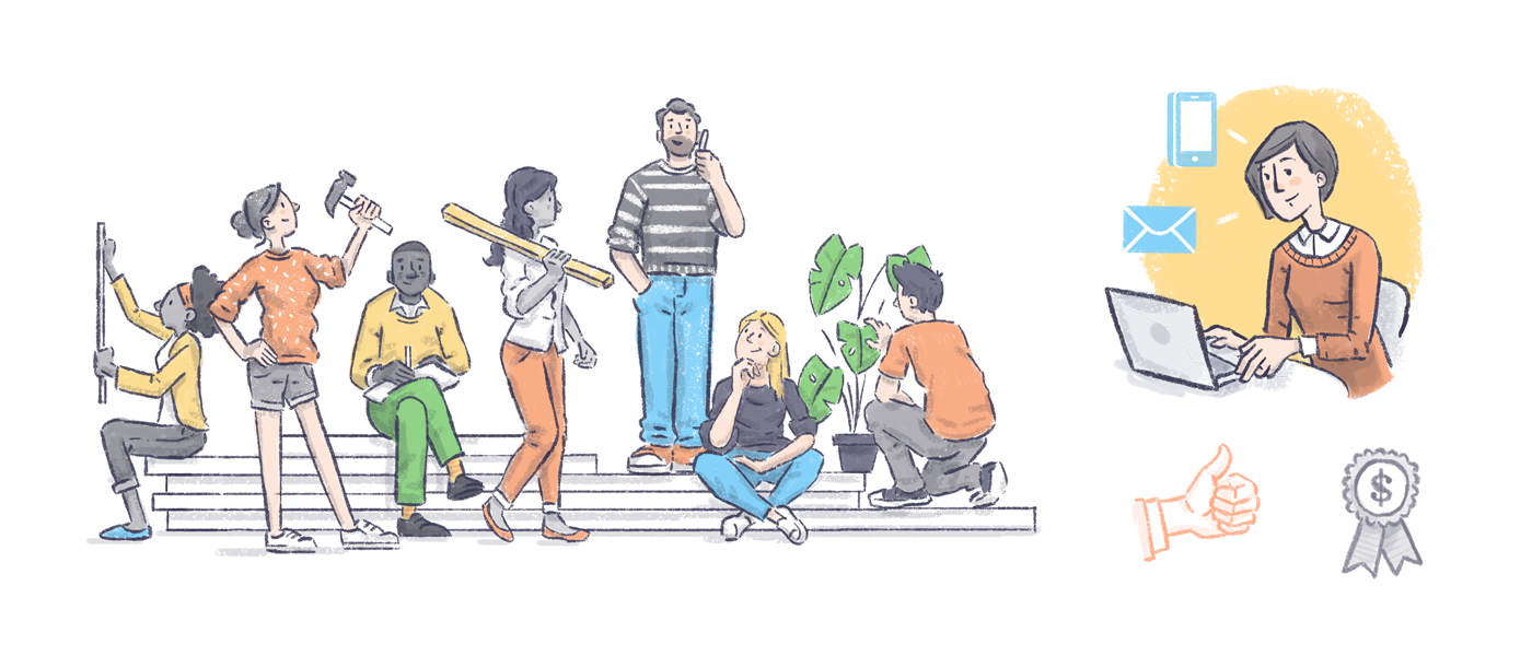
About a year after college, Hannah moved from Richmond, VA to San Francisco in search of a new challenge and a bigger design community. After about a year of freelancing, she landed a design role at Earnest, a small financial technology startup. But that job soon expanded beyond just design.
Hannah
Yeah, I didn’t really know that I was going to be able to do any illustration at that company or in tech, but it came about as a need for the brand. So I stepped up and I was like, “Listen, I gotta do this, I want to take control of this, of all the illustration here.” So that was my focus, and it was a really wonderful first learning experience of how illustration can actually function in the tech space.


Some of Hannah’s illustrative work at Earnest, sourced from her case study.
Mark
After about a year and a half, Hannah returned to freelance life. She brought those learnings from Earnest over to Putnam Studio, where she helped refine the Putnam Process through projects for clients like Credit Karma and Slice Intelligence.
Okay, so, introductions aside, let’s get down to business. The first phase of the Putnam Process is the “Brand Audit.” Here’s Ryan:
Ryan Putnam
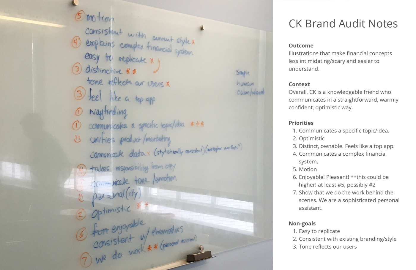
Notes from the “Brand Audit” phase in Putnam Studio’s work for Credit Karma. Sourced from Illustration Identities Are Our Thing, by Ryan Putnam.
Basically, it’s just like looking at all the assets, all the context of the brand that we’re going to be working for. Taking in their brand guidelines, their brand structure, and finding holes, or, you know, finding where illustration could like, really shine through something they might not have seen. Just really looking through and finding where illustration can have this profound effect, I guess.
Mark
With opportunities for illustration identified, it’s time to talk goals.
Hannah
So I have found that it’s really important to begin with non-visual language and just talk about your goals and talk about things in a more abstract way. I think projects really fall flat when you start with like, “We’re edgy, it’s the color blue, we need to look like data, like, it needs to look like this.” Those always, like, fall really flat for me.
So starting in non-specific terms and talking about, like, “Who’s your customer base? What’s really the big idea here?” has always been super helpful.
Ryan
We would all agree on it. Ideally, it’s like all the stakeholders—anyone that’s ever going to have an opinion about this, for the most part—agree upon these goals.
Mark
One common goal for illustration is to help demystify new or complex concepts, just as Jon Ying’s work did for Dropbox and the notion of “the cloud.” Another common goal came up in interview after interview.
Hannah
Almost everybody, one of their goals is humanizing. Which is kind of dystopian in a way, because you’re like, all you want to be so bad, that it’s a little like, “Okay, like, you’re trying really hard to prove this.”
Mark
Starting to look for seams in their human suits.
Hannah
Exactly, yeah! [laughter] It’s so often that, and it functions really differently for different companies.
Mark
In the case of Earnest, that humanizing factor was about breathing life into a potentially sterile concept.
Hannah
Yeah, I mean, we were working on a finance product, and it was super dry. So the head of design was like, “I think we need to do some illustrations.” And we wanted to bring in assets that could, you know, make the user feel empathized with. That there are actually people behind the software. Which is a really kind of weird line and a strange one for a company that is all about data and using data to do their financial processes.
Mark
In the context of creating or revisiting an illustrative brand, “goals” need not be exclusively about the direct needs of the customer. For example, in the first episode of this podcast, we explored how Ryan Putnam and Kristen Spilman’s work at Dropbox helped to unify disparate illustrative styles, improve the creative team’s structure and processes, and elevate the brand.
A few years ago, Shopify found itself facing many of the same problems Dropbox once had. Illustration had propagated across their sprawling eCommerce product, and it was beginning to look fragmented and messy. The company wanted to reboot its approach to illustration, so they turned to Meg Robichaud, who we heard from at the beginning of this episode. Meg learned a thing or two about fresh starts early in her career.
Meg
I guess when I was in high school I, like, very much identified as an artist, and I was in, like, the whole IB art track. And then I did a quick U-turn, and when I graduated, I went into engineering.
Mark
What kind of engineering?
Meg
Civil engineering. I wanted to be an architect, and I got some really bad advice from I don’t know who, but it really stuck with me, who said that if I want to be a good architect in North America, that I really should just become a civil engineer, and I believed them.
So I was in engineering for three years and miserable. I wasn’t good at it. I didn’t like it.
Mark
Man, you get a piece of advice and it burrows its way in there, and then that’s just what you do until you finally…
Meg
Completely, yeah. I can’t remember who it was who told me.
Mark
Maybe it’s better that way—you don’t hold a grudge. [laughter]
Meg
Yeah, yeah, exactly. [laughter]
Mark
After three years of misery, Meg dropped out and looked for a new direction. She made a few changes to her priorities, and looked for a school somewhere where she could snowboard, just to have some fun.
Meg
I was originally in New Brunswick—eastern Canada—and I wanted to move out west. So I ended up going to the Art Institute from there just so I could go snowboarding, and took print design and couldn’t be happier.
It wasn't like art was out of left field, because it was something I was really interested in in high school. I really just wanted to go snowboarding, and then as soon as I went to school, I was like, “Oh my god, this is what it's like to be good at something. This is really nice.
Mark
Right. What a relief!
Meg
Yeah!
Mark
After graduating, Meg spent the next seven years as a freelance illustrator and designer.
Meg
I was trying to figure out how I could start writing more illustration guides and, like, working on these bigger projects. And one of the first ones I wanted to do that with was Shopify. I was kind of stumbling my way into the right way to set up that relationship. And so I first came into Shopify to just do some consulting with them.
I kind of had, like, dug my feet in, too, to say, like, “I don't want full time, I don't want any of this, I love my freelance life.” And when I left, the now director, Kyle Peatt, kind of sent me message and was like, “I bet you like to finish the things that you start, don't you? Like, maybe… maybe you want to come back?” And I was like, “Ooh! Ooh, you're right, I really do!”
Mark
Boy, he knew exactly what to say to get right under your skin there, huh?
Meg
He did! I do like to finish what I start!
And that project is one to two years long. We found that the illustration style that they had in there now felt really fragmented and not polished, and it didn't really reflect the brand that they were aiming for.
Up until that point, it was a lot of like, “This designer made one here, and someone made it here, and now we all know that this guy's kind of good at them, if you can trick him into doing it for you.” But up until that moment, there was no team, like, maintaining and building this library with a bigger vision.
So it was just, like, the right moment to start from scratch anyway, and try and build something when we have the time.
Mark
Sound familiar? Illustration starts as an employee’s side hustle, slowly grows and grows until suddenly it’s everywhere, and yet it’s now inconsistent and it needs a more disciplined approach. This pattern that emerged at Dropbox, Shopify, and in my own case at Circle, reflects how illustration has grown at countless companies over the last decade. In a future episode, we’ll dig into the implications of this pattern, the pitfalls that come with it. But until then, back to the subject at hand.
We’ve explored how illustration can clarify the complex and humanize otherwise opaque, technical brands. We know that companies can revisit their illustration in order to standardize, which elevates the brand and improves creative processes.
But there’s one more common goal that’s worth exploring: developing a system that scales. An illustrative style that works for a 20-person startup may fall apart for a giant multinational. The company’s needs are just that much bigger, and if you have a one person bottleneck or a technique that can only go so fast, you need to rethink your approach.
Kristen Spilman found herself in this situation when she left Dropbox to join Facebook in 2016.
Kristen Spilman
They were embarking on some of the same challenges where they needed a visual language and an illustration system for Facebook. And they have been working closely with Mark [Zuckerberg] on developing this style. There was a team, a small team of about seven people, and they were looking for somebody to join and lead and scale that system.
Mark
But when Kristen arrived, she discovered that the style had already received Mark Zuckerberg’s sign off. This made it difficult for her to have much influence. The style was centered around papercraft—actual paper, cut and folded to create forms.
Kristen
And what was rooted behind that approach was that it was important for Facebook to show that there was people behind the products that were being built, and that this craft showed imperfection. Um, a notion that it wasn't just robotic and technical, in terms of what this product offered, but it was made with care, and it was made by people, for people. And the paper craft kind of embodied that materiality, the tactile qualities of the human touch, and also, just opportunity for imperfection and how we showed it.
Mark
In other words, they were looking to humanize.
Kristen
It was a little surprising because if scale is the goal, you know that some of the things that you need to solve for are systems thinking, in terms of defining the right balance of constraints that lead to the maximum amount of expression and flexibility, while still feeling like it's coming from the same place.
Mark
That, by the way, is a perfect encapsulation of what makes a great brand system, illustrated or otherwise. Let’s say it again:
Defining the right balance of constraints that lead to the maximum amount of expression and flexibility, while still feeling like it's coming from the same place.
Ah! So good. Okay, back to Kristen.
Kristen
...and paper, handcrafted paper, almost these sculptural forms, really kind of fought that notion, which I really believe in. That's how I approach building out these systems, but the paper system introduced some new challenges because you needed a very specific skill set in order to do that.
Mark
Despite her skepticism, Kristen gave the approach a fair shot. She hired about a half dozen paper artists from around the world. But as predicted, scaling the work to Facebook’s immense needs became a significant issue.
Kristen
I ended up parallel pathing a process to reconsider what the style could be if it was created with more digitally native approaches like using raster or vector illustration.
Mark
How do you explore a whole new style without disrupting work on the current one? It’s time to bring in outside help, and with a company as large as Facebook, it’s unlikely a single freelancer could produce the sheer amount of work required. You need a studio.
Kevin Walker
My name is Kevin Walker. I'm a creative director here at Buck at the Los Angeles studio.
Buck was a lot easier to define about ten years ago. You know, I think maybe the entire industry was easier to define. It started as a motion graphics studio in the baby years of motion graphics, somewhere in the early 2000s. But it's grown massively since then, and kind of morphed and twisted and sort of just evolved into a design studio that's often sort of is tasked with coming up with stuff that is still motion graphics, but also weird problems that arise from different partners that they need a sort of a fresh eye on.
Mark
Kristen had turned to Buck once before, back when she was at Dropbox. They helped translate the Dropbox illustration style into animation. When it came time to pursue a new take on illustration at Facebook, she called them in.
Kevin
Buck brought Dropbox’s illustration system to life as animation
She wanted to give us time to explore. You know, she wanted to make sure that if Facebook embraced a new illustration style, that it really could have a wider tonal spectrum than just, you know, cute or happy. It needed to have moments where it could be empathetic or it could be quiet or all of these other things that a company really has to communicate. Or show that it has understanding and show that it was like worldly, you know, that people could kind of connect with it, no matter where they were.
Mark
Okay. So that’s phase one. Whether it’s to humanize, standardize, or something more specific to the particular brand, establishing a clear set of goals gets everyone on the same page. All the work that follows will be measured against these objectives.
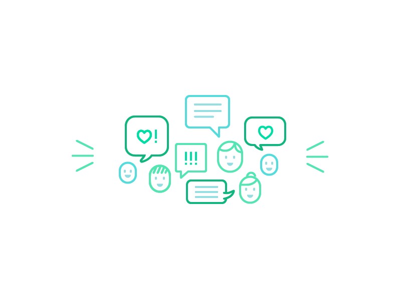
It’s time for phase two: the “Visual Landscape.” This is the first opportunity to introduce imagery, to demonstrate how purely verbal goals and seemingly abstract brand attributes might manifest as illustrations.
Ryan and Hannah create a series of mood boards—collages of found imagery. Each board explores one stylistic directions the project might take. They collect images from their own past work, competing brands, and well, everywhere.
Hannah
And I'm always trying to, like, reference things that are out of the industry. And just really, like, diversifying my sources of inspiration has been really helpful.
Mark
Of course, sketching up a few small pieces isn’t out of the question.
Hannah
It's usually samples of other work, but I've certainly, like, sketched up little icons, just kind of like, quickly communicate an idea. And you just have to, like, as all freelancers know, you have to make that decision about what is most time effective at this moment. And sometimes it's just, like, drawing it if you have an idea in your head.

A mood board from the “Visual Landscape” phase in Putnam Studio’s work for MessageBird. Sourced from Illustration Identities Are Our Thing, by Ryan Putnam.
Mark
The mood boards explore different points along stylistic spectrums. Perhaps one involves simple, abstract geometric shapes in brightly saturated colors. Another is literal, with richly rendered, clearly identifiable objects. Some are broad, meant to touch on all the goals, while others focus tightly on just one or two.
Hannah
I pitched them like three different styles, and I try to, within those styles, have one that is what they said they want, one that is what I think they want, and then one that is just pushing them in a different direction.
I've had a client who was like, “We're Bruce Springsteen, we’re rock and roll, we’re, like, out there!” And I was like, “Great, you want an out there style. Like, here you go.” And I, like, pitch a mood board, and it always elicits a really strong reaction. And that's so helpful. It's a really great shorthand that I've found to pitch stuff. And yeah, you always get that strong reaction. They’re like, “Just kidding, we're not rock and roll. We are a data company. I'm so sorry.”
Mark
We’re maybe elevator jazz. Let’s, let’s pull back a bit.
Hannah
[laughter] Exactly! Yeah.
Mark
In past illustration projects, I’ve always gone from goals right to sketching. It never occurred to me to use mood boards, a tool I’ve relied upon for branding, user interface, and user experience projects. Honestly, I think they’re even more relevant here.
Drawing can be perceived as highly personal. Taking original work out of the equation adds a bit of distance; it dials down the emotion. Clients can get their feet wet talking about something safe before they’re asked to provide feedback on something new.
This is especially important because key stakeholders often don’t come from visual backgrounds. They might be fluent in business or engineering, but if they’ve never sat in an art school critique, talking about design may be outside their comfort zone, or they may have preconceived notions of what illustration is and isn’t.
Ryan
Forget what you think illustration is, like, what illustration is for our company is “A, B, C, D, E, F, G,” or whatever. And then only think of it in that context, and then we’ll have a lot easier time talking about it.
Mark
Mood boards are an opportunity to expose clients to a broad range of options while directly tying those visuals to business goals. It’s not about “do you like this?” It’s about “does this achieve the goal we agreed upon?”
Ryan
I think what really resonates is the addition of those goals, or that language that we’re building into it. When you clearly define something, “When I’m saying ‘delightful,’ it means this exact thing.” And then most people could like bridge those gaps, of like, “Oh, is this style kind of ‘delightful,’ especially in the way that I mean?” So it, it definitely helps out.
People think about stuff differently, but they all tend to think about the success of their company the same, though, and that’s usually based in some set of goals. They all get this, this is how we structure everything else, so just speak to them on their level. And that’s, that’s the best.
Mark
Okay! You and your stakeholders have agreed upon a direction. Now, it’s time to start turning that direction into some original illustration work. Because after all, you likely haven’t drawn anything yet! The Putnam Process calls this third phase “Style Construction.” Here’s Hannah:
Hannah
This is always, like, the most challenging phase for me. Putting together, like, a small sampling of the style.
So here you have to be really intentional to hit on the main elements from the mood board that you’ve chosen, without, like, obviously being derivative. And here’s where you start to marry your idea with any kind of existing brand elements that they may have.
And this is, yeah, you’re really finally using your, like, visual brain and just drawing and considering all the research that you’ve done.
Ryan
It’s way more focused around, you know, a specific mood board that they picked out based on some priorities that they’ve already picked out. So it’s, like, very concentrated, rather than this, like, broad kind of exploration of illustration, where it seems endless, and people are picking out certain things that they like from different things. Ideally, we’re like, you know, funneling people into their ideal style.

Examples of the “Style Construction” phase by Putnam Studio. Sourced from Illustration Identities Are Our Thing, by Ryan Putnam.
When we’re in this “Construction” phase, we iterate a lot still on that specific style. We’ll, you know, work it through, you know, probably a set number of illustrations that would, like, ideally represent the wide gamut of what the illustrations will be. So like, a small illustration, a medium illustration, a bigger one, to give, like, a good kind of idea of what this could look like.
Mark
As I mentioned at the top of the show, the Putnam Process, though similar to other branding workflows, isn’t a universal truth. It’s just one company’s way of codifying their methods, of reassuring clients that the work is neither wizardry nor snake oil.
What works for a small firm of just a couple illustrators may not translate to a heavily staffed consultancy like Kevin Walker’s team at Buck, or an in-house team like Meg Robichaud’s crew at Shopify.
Mood boards, for example, never came up in my discussions with Kevin or Meg. Instead, the “Visual Landscape” and “Style Construction” phases sort of blurred into a collaborative exploration phase.
In Meg’s case, Shopify wasn’t just looking for an illustrative facelift. They were re-considering their entire brand. It was a pretty open-ended process.
Meg
I was working with a small team who were working on the entire redesign. Basically everything was up for grabs. And I would kind of go and work with them fairly closely, and a lot of just like, I would come up with an illustration style, and then one of the brand designers on marketing or one of the product designers would try and make something that matches that. They would come up with a whole new Shopify look and I’d see if I can make an illustration style that matches them. It was kind of like, all over the map. Just a lot of people who hadn’t worked together before with no constraints, trying to find somewhere that we can all fit together.
Anytime I found something that seemed to be working, I’d take it back. We had a team of some pretty talented illustrators who were working on the current illustration style while I was figuring out the new illustration style. I would bring what I had found so far and then they would push it a lot further. So I think it was a lot of collaboration from to two teams, and once those kind of came together in something that both teams were really proud of, then we kind of started taking it to the directors and getting some, like, actual critiques on it and, like, massaging into something that works for everyone.
Mark
As for Buck, with more hands on deck and more time to breathe, their creative team was able to bounce ideas and aethsetics back and forth, building off each others’ energy in search of a visual voice that would resonate.
Kevin
And so we spent a few months working out different styles. We had this crack team of illustrators—they were all staffers—work on the initial rounds.
And we presented a bunch of styles, we started to hone down on one. And Xoana Herrera, who is a fantastic illustrator—people should look her up because she really, her talent is amazing—her style, kind of, is where we started to coalesce, what she was presenting. And then we started to build on it and refine it.
And then Kristen started presenting it up the ladder. And it seemed it seemed to really resonate at Facebook, it seemed to be answering a lot of this stuff, checking off these boxes that they wanted. And she turned back and she said, I think, I think we’re go, let’s do this. And at that point, we started to develop it into a system.
Mark
That’s right, it’s not over yet.
You’ve audited the brand, you’ve found areas where illustration can shine, and you’ve set goals and explored a number of visual directions. You’ve collaborated, reviewed, and refined. You’ve educated stakeholders, integrated feedback, and put your best recommendation forward.
What you have right now is a style. Those sample illustrations you just got approved capture a sense of line, and of color, texture, analogy, and metaphor. But what works in a small spot illustration may fall apart when it’s blown up to billboard size for that big ad campaign. Icons that look great on a light background might look like film negatives on a dark one. And besides, you only made a dozen icons. The client needs a hundred!
Holes in the style are popping up everywhere. But fear not! It’s all part of the Putnam Process.
[Theme music]
Mark
On the next episode of How to Draw a Startup, it’s time to build it, break it, scale it, scrap it, write it, fight it, twist it, bop it, you name it. It’s time to turn that style into a system.
• • •
Kevin
So moving fast in the beginning and really doing a ton of iterations. I was joking while we were working on the style guide that it felt like doing an illustrated Moby Dick, like, three times over.
Stewart Scott-Curran
I remember getting a style guide for Coca-Cola that was 350 pages long. And you can understand why that’s the case. It’s multiple use cases, multiple languages, you know, all that stuff, but it’s just, like, pretty overwhelming. And who ever read all of those 350 pages? Like, nobody.
• • •
Mark
Step 3 is coming January 17th.
How to Draw a Startup is written, produced, edited, and scored by me, Mark Grambau.
You can subscribe to the show via Apple Podcasts, Spotify, or wherever fine podcasts are found. And while you’re there, please leave a rating or a review! I’d love to hear your feedback, and it helps others discover the show.
You can also find the show on Twitter and Instagram at @drawastartup. Thanks to those of you who’ve been leaving comments, retweeting, et cetera. I really appreciate it!
Also, check out howtodrawastartup.show for helpful links and illustrations, more info about my guests, and full transcripts of each episode.
Of course, I’d like to thank my guests this week, Ryan Putnam, Meg Robichaud, Hannah Swann, Kristen Spilman, and Kevin Walker for sharing so much insight into their work and processes.
I should make a point I missed in the first episode. A quick disclaimer, just to keep things kosher: neither my guests nor I speak on behalf of our respective employers.
I referred to a number of sources for this episode. I learned about the Putnam Process from Ryan’s post Illustration Identities Are Our Thing. Also, Meg Robichaud has written a ton about illustration in tech, including articles about the use of metaphor, tips for leading an illustration team, and so much more. I’ve included a bunch of links in the show notes.
Okay, that’s all for now. Thanks for listening.