Do you remember when you first discovered design? The balance of form and function? This week, hear how four young creatives—and the tech industry—came to embrace design and illustration.

Show notes
Today’s guests:
Recommendations:
Welcome to Macintosh
A podcast about the history and culture of Apple and its community, created by independent radio producer Mark Bramhill. The first four episodes of season three dive deep into the process of how new emoji are introduced.Aqua Screenshot Library
An exhaustive gallery that demonstrates how Aqua has evolved over the years, created by podcaster, writer, and Mac collector Stephen Hackett.
Transcript
Mark
When did you first notice design? How old were you when you discovered the interplay between form and function, the art and craft of making the world a more elegant and intentional place? For designer and illustrator Guillermo Mont, that realization came early. Like, really, really early.
Guillermo Mont
Kind of one of the things that I use as, like, maybe the first moment of being aware of design: I was pretty young, probably like, maybe five or six. And we had this TV controller that I thought was awful, ‘cause it was just this rectangle, and inside of it was just, like, a straight up grid of rectangular buttons. And there was, like, no hierarchy, no emphasis, essentially no way of, like, letting you know that power was more important than volume, et cetera. And I just remember grabbing a bunch of my Legos and deciding I was going to make a better version of that controller.
Like, I was… yeah, I was really young, I had no idea what I was doing, but I just inherently knew, like, instinctively knew that there’s something wrong with this controller and I can make it better. And that’s kind of how it started.
Mark
Many of the folks I interviewed and just about every designer I know have all described a similar “aha!” moment, though it usually occurred well after elementary school. Once your eyes open to the power of good design, you can’t unsee it, like the arrow in the FedEx logo. (If you don’t know what I’m talking about, pause this show, look up the FedEx logo, and come back to me when you see an arrow.)
The funny thing is, though, it’s not just people that experience that aha moment. It can happen to entire industries. Throughout my childhood, the computer industry as a whole was definitely pre-a-ha. Everything felt so utilitarian. Only Apple seemed to champion design, but they were a bit player on the edge of extinction.
Thankfully, we’ve come a long way.
On today’s episode, I’ll tell the story of how four young creatives—and an industry—came to discover and embrace design and, of course, illustration.
I’m Mark Grambau, and this is How to Draw a Startup: A step-by-step guide to illustration in tech.
[Theme music]
Mark
Step 6: Sweat the small stuff
Guillermo’s creative awakening continued throughout his childhood, as he began to see design all around him.
Guillermo
As a kid, I was always super interested in animation, cartoons, comics, anything visual. I think what kind of got me really interested in design was the idea that video games were designed by, like, designers, and they had to figure out how to convey gameplay with, like, very simple graphics. And I was just kind of fascinated by, you know, the idea of, like, how do you get this idea and turn it into a game?And how do you make the game fun?
Mark
That spark never went out, and he wound up pursuing design in college.
Guillermo
I consider myself fortunate that I went to school for what I wanted to do and ended up doing what I wanted to do and I’ve just been doing it ever since.
You know, straight out of school, I wanted to be an illustrator. I think that was kind of the ideal, like, wouldn’t it be great if I could be an illustrator? That would be amazing. But I think, especially when you’re, you know, 22, and you have your degree and you’re just trying to figure out, like, how can I even start working? There wasn’t any, like, roles where I could be a full time Illustrator, at least, you know, where I was at the time.
It was kind of an interesting time because you could see illustration in, like, places like Google or, you know, these big web presences. But they were very, like, almost like easter eggs). Like an empty state had this cool little illustration or you could see, like, a Google Doodle. So there was almost an idea that there was illustration, but it was almost like an afterthought. Like it wasn’t something that, you know, people were necessarily going out of the way to do. It was like, “Let’s sneak this in.” So I just remember seeing that and thinking, like, “How can I get a job doing that?” You know?
Mark
Guillermo graduated in 2007, and as I mentioned way back in Step 1, I found myself in a similar position just a year later: illustration degree in hand, trying to figure out how to fit my skills into a full-time job.
He and I landed on similar paths, getting our starts in web design, but Guillermo was far quicker than I to recognize a natural professional intersection of illustration and design.
Guillermo
Iconography was kind of the best way to split the difference. Like, I could use my illustration skill set to create these icons, and that was kind of like the dessert part of my job.
I would go home and I would actually just kind of crank out and work on my own icon set for no reason other than just to do it. Like, I just enjoyed it so much that it kind of became my, like, after work passion. And after, like, a year or so I had this huge set of just random icons that started because there was something that I wanted that was very particular and I couldn’t find, and decided just to roll out my own version. And that was kind of how I scratched that itch.
Mark
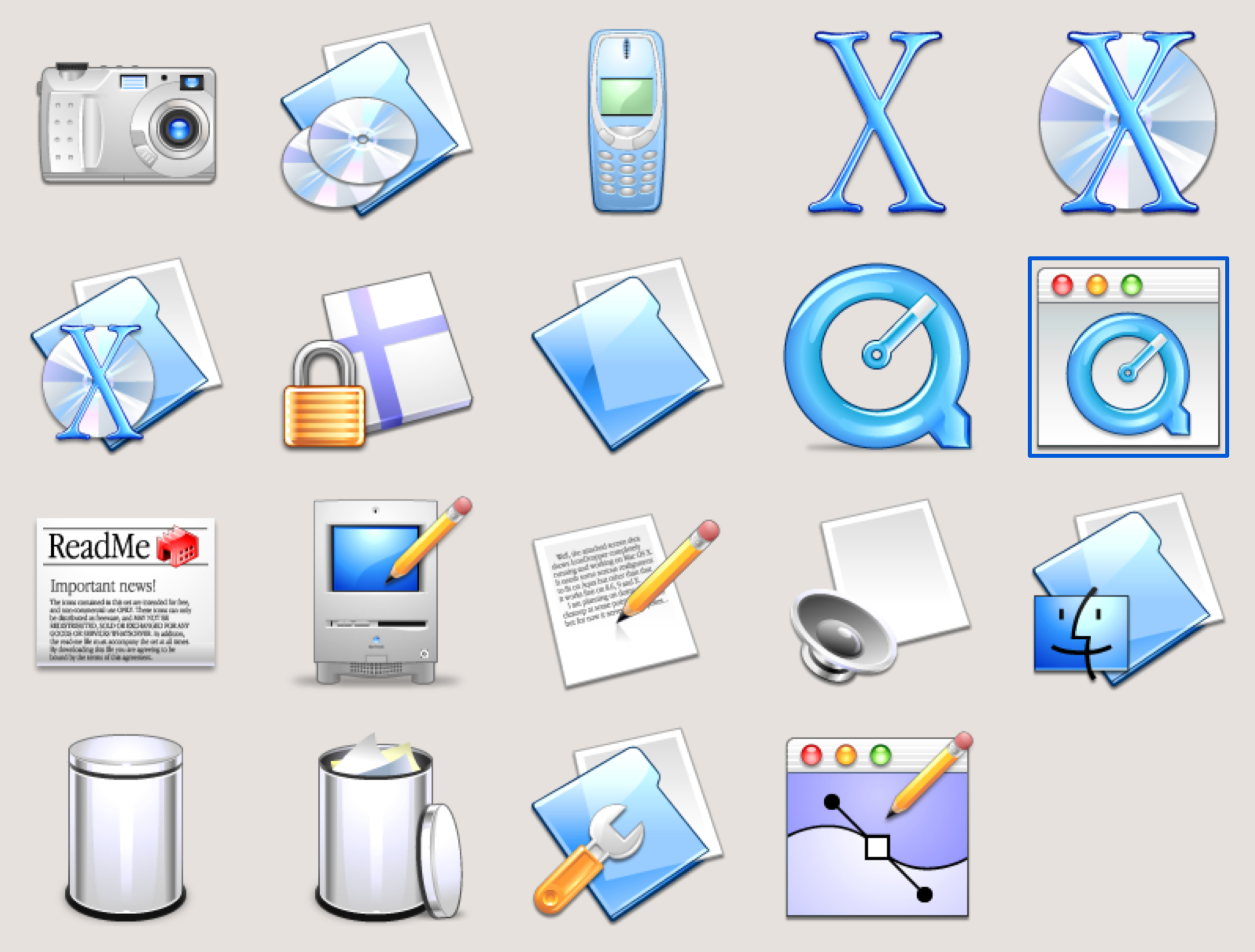
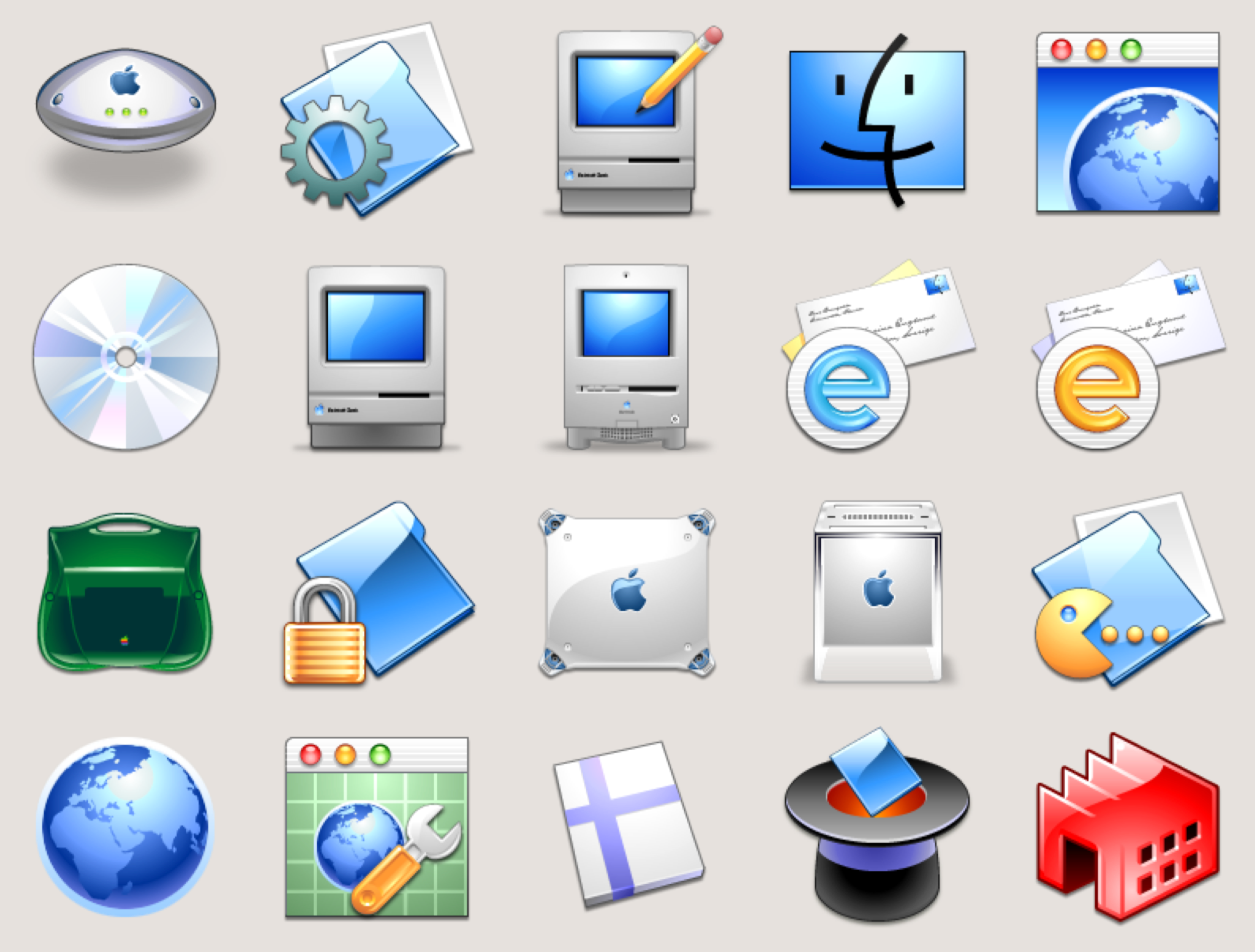
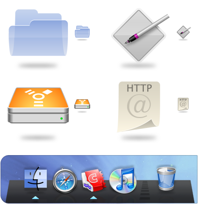
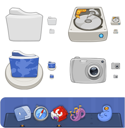
Guillermo’s custom icons were for his Mac. Alternative versions of the system defaults like a new folder icon, a new trash can, new application icons for Safari and iPhoto. And he wasn’t alone.
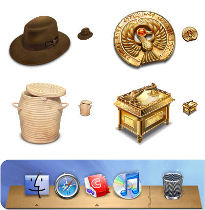
At the time, there was a really active community of icon enthusiasts creating and sharing fantastically creative, beautifully rendered icon sets for the Mac. There were Tiki-themed sets, monster sets, Indiana Jones sets. Sets that made every folder and document look as though they were constructed from wood or metal.
Guillermo
I was definitely into, you know, finding cool iconography and then replacing the existing, you know, icons with the new set. I think it was, like, was it “Iconfactory” that kind of had those sets you could, like, swap in? And they had, like, an application to help you do that?
Mark
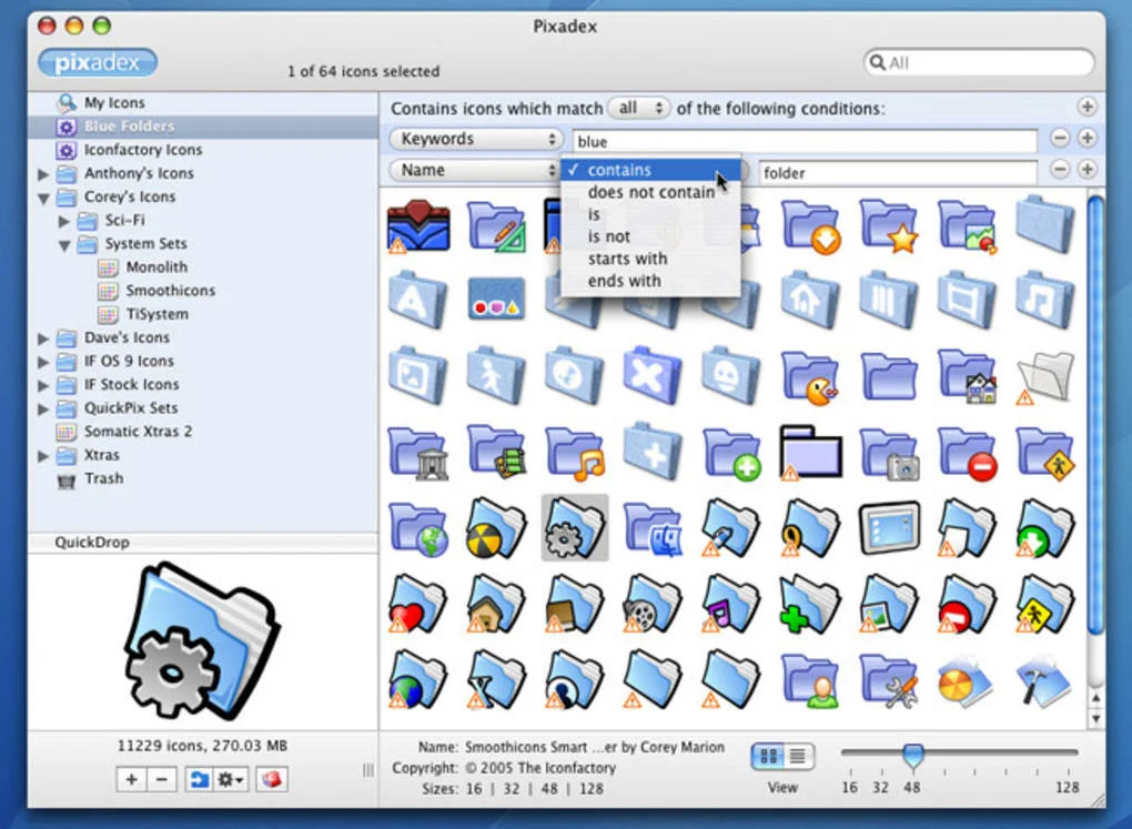
The app was called Pixadex. It was like iPhoto for icons, enabling you collect and organize custom icons as you would digital photos. Its companion app, CandyBar, made it easy to apply the icons and other UI tweaks across the operating system. Pixadex and Candybar were produced by a partnership of two independent Mac software companies: Panic and, as Guillermo said, The Iconfactory.
Gedeon Maheux
Hi, my name is Gedeon Maheux and I'm one of the owners and I’m also a designer at The Iconfactory in Greensboro, North Carolina.
Mark
As a kid, Gedeon loved computers, but couldn’t get a hold on computer science.
Gedeon
When I was in middle school and high school, I always thought I was going to go to college for computer programming. I loved computers. I had an Apple IIe, that was my first computer. And I thought that was gonna be my career, but I really stunk at math. But I knew I wanted to do something with computers, so I was trying to figure out, as I got ready to enter college, what could I do?
And all growing up, my mother, Betty-Jeanne Maheux—she was an artist and she taught art at our local school—and she tried to get me into art and I just didn’t want to do it because she was my mother, you know? [Laughter]
So when the time came to come to college, you know, she was like, “Well, why don’t you do something with computers and art?” And I was like, “Well… maybe?”
Mark
They searched and searched, and found that the Rochester Institute of Technology had a master’s program in computer graphics design—one of the first in the country, as this was the late 80s. He got in, studied graphic design as an undergrad, and continued on to that master’s program. It was there that he met Talos Tsui, who would later become his fellow co-founder.
After graduating RIT in ‘94, Gedeon and Talos worked a handful of creative jobs together, but after going through one too many layoffs, they began thinking about doing their own thing.
Gedeon
And all the time we were doing that, we were doing freelance work on the side—Talos and I and our friend Corey, who also had worked at MCI, the three of us—and we were doing freelance work designing icons. And after the second time we were let go, we were like, “No, we’re not going to be let go anymore. We’re going to make our own company.” And we formed The Iconfactory and started doing icon design full time.
Mark
Gedeon, Talos, and Corey’s first major clients were seriously big.
Gedeon
Our very first big client was Microsoft. We did the icons for Microsoft Outlook Express for the Macintosh. And then also Apple hired us to do the icons for Apple Keychain) in Mac OS 8. And those were our first two big ones. Those allowed us to really—we got a small, tiny office. It was 600 square feet in Greensboro. And we had three computers and a mail server and that was it.
Mark
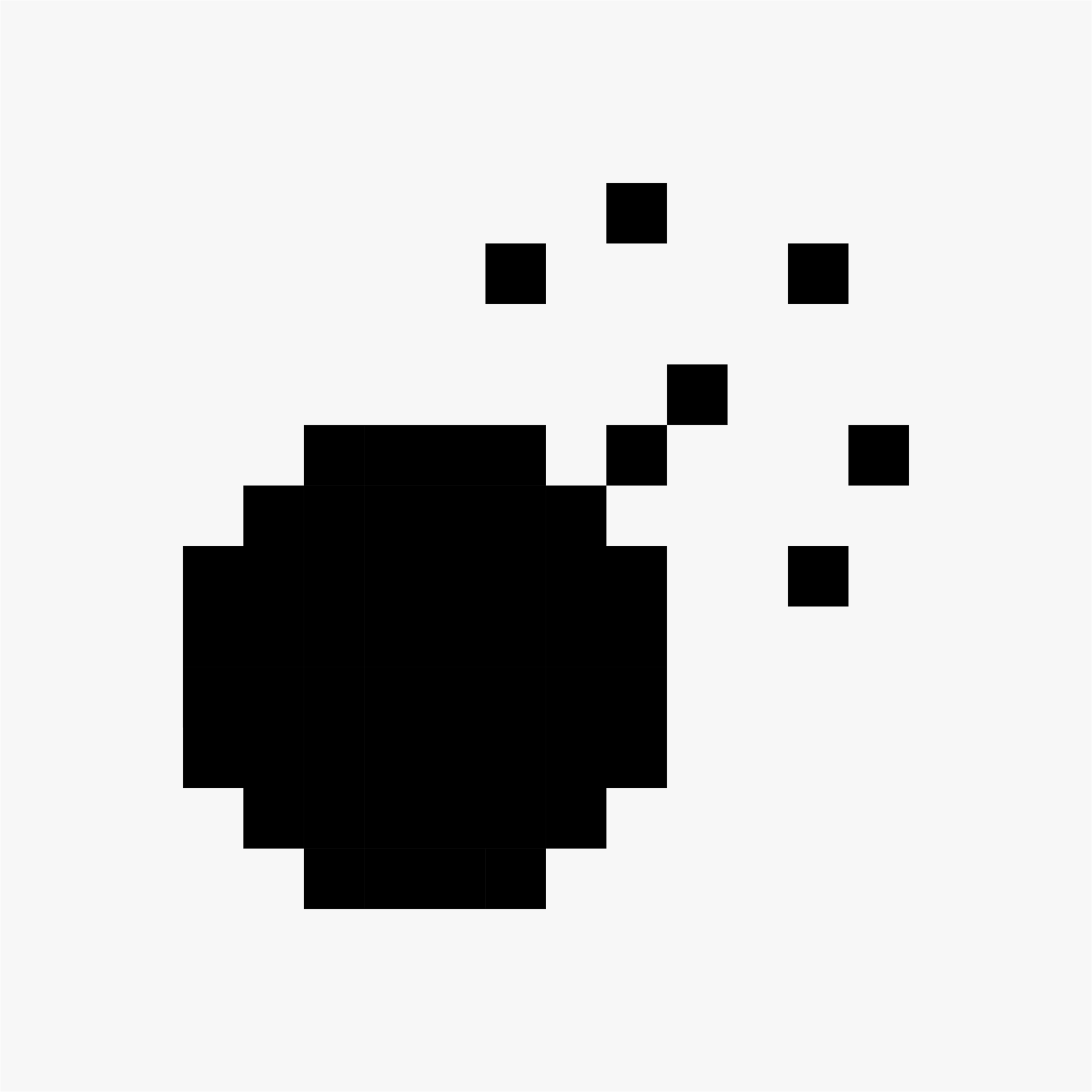
A small company for small graphics. But don’t let size fool you. As we discussed in Step 1, icons have long played an important role in making computers friendlier and more accessible, going back to Susan Kare’s groundbreaking icons for the original Macintosh in 1984. Her expressive glyphs were structurally simple: black and white and just 32 by 32 pixels, like tiny crossword puzzles.

Proportional fonts designed by Susan Kare for the original Macintosh.
Those icons were just one part of the Mac’s emphasis on design. The machine itself was beautiful, designed by the prestigious German firm frog design. It was the first mainstream computer to render proportionally spaced fonts, an achievement in technology and good typography. The Macintosh was beloved by designers, photographers, and artists of all stripes, but that wasn’t enough to keep the company away from the edge of bankruptcy in the mid-90s when Windows was at its most dominant.

Things started to turn around in 1997 when, after over a decade away from the company, Steve Jobs returned to Apple. A year later, the company released the iMac, the first collaboration between Steve and Jony Ive. It was truly radical, a curvy shell of colorful, translucent plastic, designed to make the computer friendlier than ever. A fresh new manifestation of the Macintosh ethos.

The iMac was a hit and the design spread across Apple’s lineup. And despite sneers from Windows PC manufacturers, the iMac aesthetic was enormously influential across industries, defining the look of countless consumer goods for years to come.
But for all that color and flash and nearly fifteen years of improvements to computer graphics, the Mac operating system was still relatively conservative. Interface icons were still just 32 by 32 pixels and had only upgraded to 256 colors.
But in 2000, that all changed. Here’s Gedeon:
Gedeon
I remember watching that keynote where they introduced Mac OS X and the large 128 by 128 pixel icons—quote unquote “icons” in the dock and on the home screen, and I really thought our careers were over, you know? Because we had spent the last four or five years creating 32 by 32 pixel art, you know, with 256 colors, and that was it, you know? We got known for that and we were really good at that. And then Apple comes along and introduces this whole new operating system, and all of a sudden icons are ten times bigger and they can have millions of colors and you can do whatever you want. And they introduce all of these guidelines for icons, including, like, if your app was a utility, it had to be primarily grayscale. They had to all be, you know, presented at this angle on the dock, they had to have certain lighting, and all this. I remember watching that keynote and being scared out of my mind, you know? That this was going to be the end of it.

An example of the Aqua aesthetic, as seen in an early release of Mac OS X. Sourced from Stephen Hackett’s Aqua Screenshot Library.
Mark
This new look was called “Aqua).” Steve famously described it as “so good you want to lick it.” It was full of color and gloss and shadows. It was the iMac hardware melted down into software, shiny and liquid.
Gedeon and his team worked tirelessly to learn the new style.
Gedeon
We had to get good at it really, really quickly, you know? Thankfully, at the time we had we had expanded and we had hired recently David Brasgalla. He had won our Pixelpalooza icon design contest a couple years earlier. And he was so talented, he took to it right away and it was no problem at all for him. He just, it was like a duck to water. And he created this series of icons called World of Aqua that blended right in with Mac OS X, they look perfectly at home.
World of Aqua icons by David Brasgalla
That also helped boost the business at the icon factory because potential software creators saw that work on our freeware sets and they hired us and it expanded our business. And we all got good at it, we practiced, and we enjoyed it. And it was a wonderful expansion of artistic creativity.
Mark
The visual changes didn’t stop at icons. The new operating system included tools to make apps more fluid and animated. Apple itself led the way. Take Dashboard, for example, a customizable screen of widgets for displaying at-a-glance information like weather and movie times. When you dragged and dropped a new widget onto Dashboard, it didn’t just stick in place. It dropped into the screen. Waves appeared to ripple out from its edges, your Mac suddenly a pond. It was interface infotainment. It endeared and educated, reinforcing how the feature worked while also making you want to try it again.

A look at Dashboard, as catalogued by Stephen Hackett
Indie software developers embraced the tools as well. Delicious Library, an app for cataloging your collection of books, DVDs, and CDs, rendered book jackets and DVD covers to look like real media displayed on wooden shelves.

A glimpse of Delicious Library 2 from Delicious Monster
An app called Disco, which did nothing more than burn CDs and DVDs, used the new tools to render a live smoke effect. It looked as though the app itself was burning, smoke rising from its window. And if you blew on your Mac’s built-in microphone—[air blowing sound]—the smoke would whip and whirl about.
These are called skeuomorphs: elements inherited from a referenced original where they were once part of its construction or function, but, in this new context, they aren’t strictly necessary. They make the new more familiar by referencing the old. They can be decorative, informative, or both.

Smoke rising off Disco as it burns a disc, turned into a GIF from this YouTube video
Admittedly, apps like Disco were all form and little function. The era was a fascinating mix of maximalism and minimalism. Unprecedented visual capabilities put in service of intuitive interaction design. Icons and interfaces were coming alive.
Though a lot of this was seriously over the top, I look back at this era fondly. That’s because this is when I had my aha moment. This is when I discovered design.
[Macintosh boot chime]
When I was growing up, my dad built custom Windows PCs as a hobby, so that was the world I knew. I was a curious little nerd. I’d spend hours—pre-world wide web—clicking every menu item in Microsoft Word just to see what would happen. But computing at that time still meant a lot of command line interfaces, which I found obtuse and frankly, terrifying. I actually had a recurring nightmare in which I typed something wrong into DOS and somehow wiped the whole computer—a geeky version of that stress dream where your teeth fall out.
Anyway, as much as I liked computers, I loved drawing. When I was fifteen, my parents decided that if I was headed towards art school, I should probably learn to use a Mac.
It was 2002, and my family purchased an iMac G4, the successor to the candy colored original. The G4 is one of strangest yet most iconic computers of the last twenty years. It looked nothing like its predecessor. The display was a thin slate attached to a shiny metal arm, which was anchored to the north pole of a pristine white hemispherical base (the actual computer).
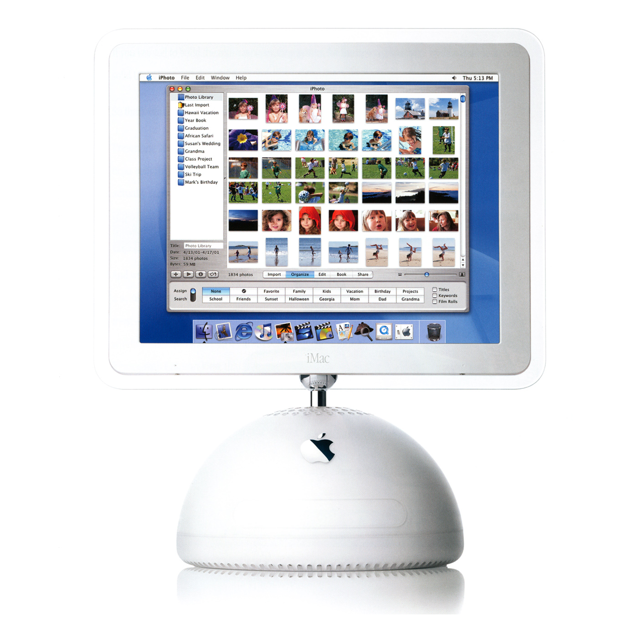
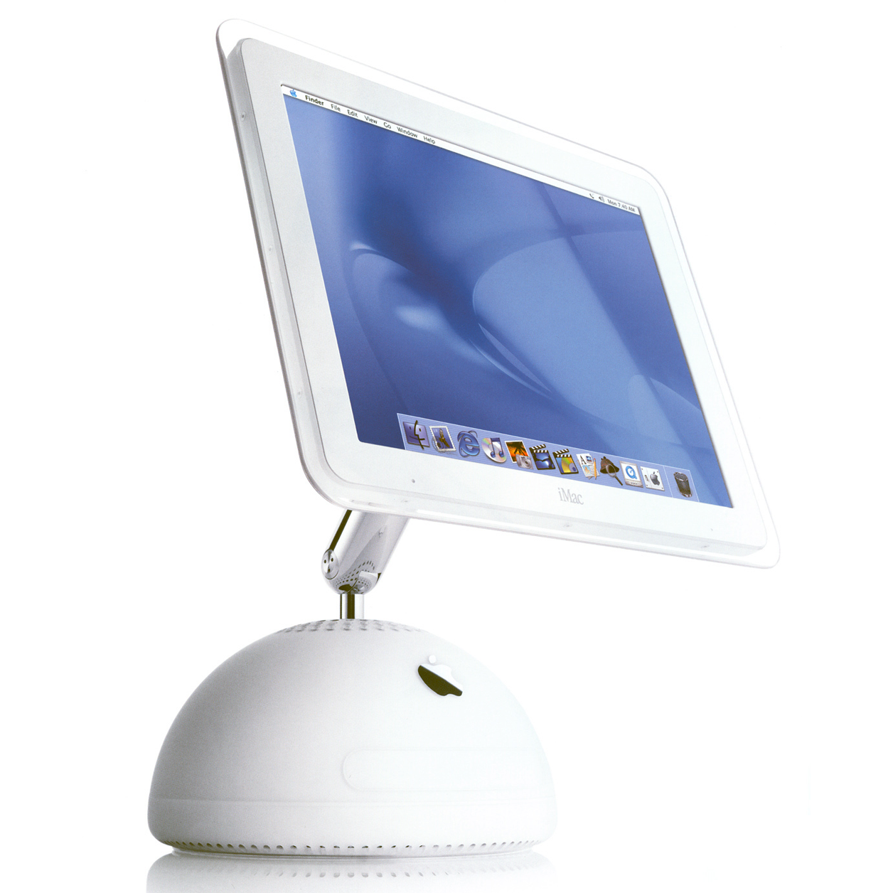
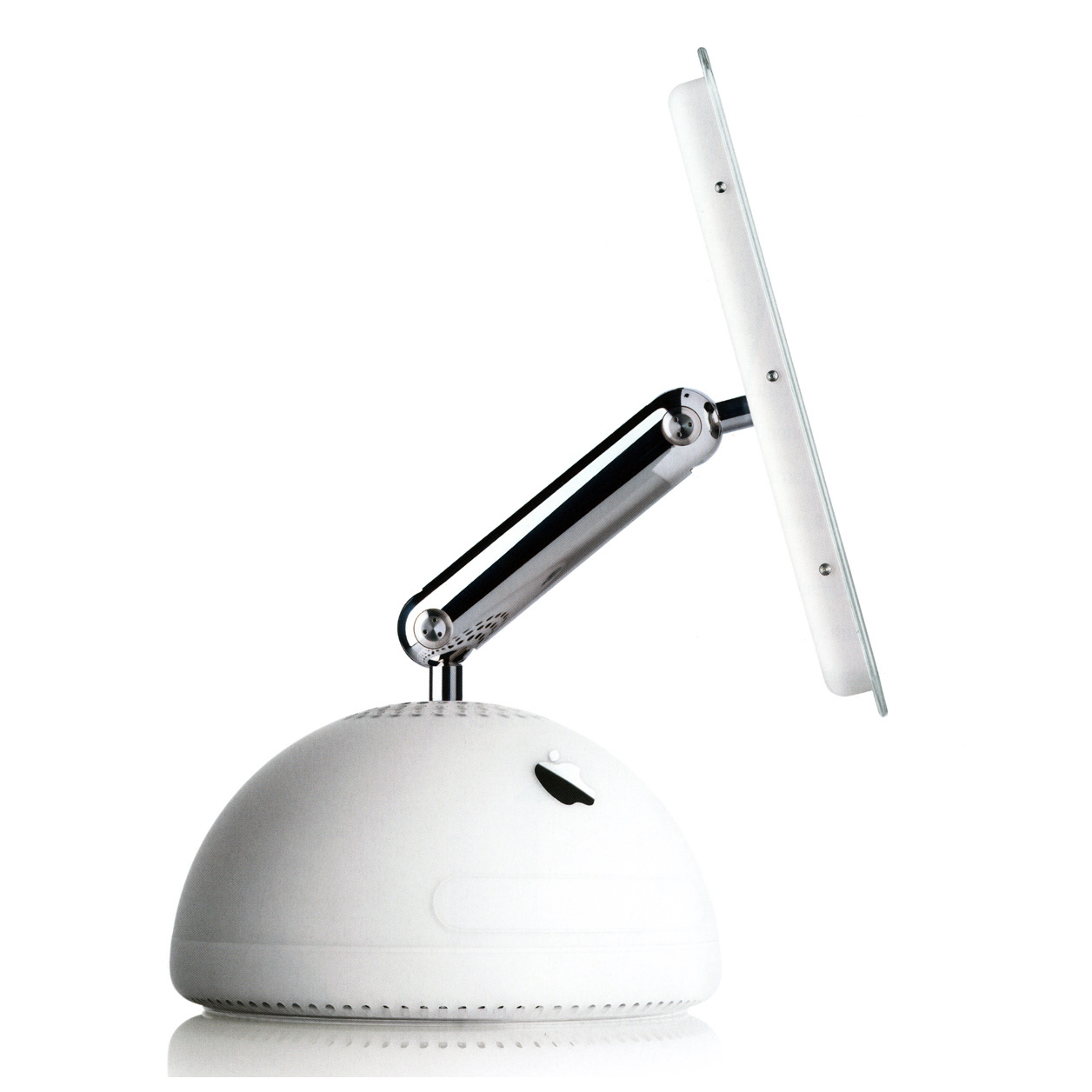
The screen floated perfectly in place, and yet with the gentlest nudge of my pinky finger, I could raise it, lower it, turn it, tilt it. The computer ran cool and quiet, an entire world apart from my old Windows tower with its four or five loud, struggling fans. On the iMac, air entered through slits around the perimeter of the base, and as the machine generated heat, the warm air would naturally rise and escape through small holes around that north pole, pulled along by a single nearly-silent fan just beneath the surface.
And if that wasn’t enough, I marveled at the graphically rich software, which wrapped profound capabilities in approachable, intuitive interfaces. In that first year, with built-in software alone, my friends and I created an hour long movie full of music and visual effects, and burned it to a DVD with interactive menus, just like Hollywood—or so we thought, anyway! And, like Guillermo, I discovered Pixadex, The Iconfactory, and the world of custom icons.
This iMac was an absolute revelation. The hardware, the software, the balance of form and function. It was my introduction to design. I learned that computers didn’t need to inspire stress dreams. Instead, by prioritizing user experience and attending to every last detail, technology could be elegant. It could be empowering.
I became a devote Mac enthusiast. It’s no wonder my life and career have centered around the nexus of creativity and technology ever since.
But as incredible as the Mac was, it remained niche. In the mid-2000s, Windows was still as dominant and clunky as ever. The PC industry served large scale businesses first and foremost, prioritizing the needs of those who signed purchase orders for ten thousand desktops, not the ten thousand employees who had to use them day to day. This separation of buyer and user treats computers as commodities, judging them by quantitative metrics like price and processor speed while neglecting qualitative measures like user experience. Consumer PCs were yet another step removed—business machines repackaged and cheapened. Corporate buyers were the priority. Everyone else would have to make do with the runoff.
For design to catch on, this entire system would need to change. Design needed to prove that good user experience could mean good business—an uphill battle when PCs seemed to be doing so well without it.
But in January 2007, the road to a design-centric future came into focus.
When Steve Jobs revealed the iPhone at Macworld San Francisco, the world had never seen anything like it. A device built around multi-touch technology—no physical keyboard, no stylus—and dominated by a high resolution screen that responded instantly and fluidly to every tap of the finger, every swipe, every pinch. And just as folder and file analogies helped demystify graphical computing in the 80s, this touch-first device called for new metaphors, new visuals, a whole new interaction paradigm. The iPhone’s interface used light and shadow and texture to show users how to interact with it.
Angela Guzman
Yeah, and so the original intent, and I think this is something that Steve had explained at beginning of iPhone, was to create apps in a way that were easy for people that use them to understand what they were supposed to do.
Mark
That’s the voice of Angela Guzman, who began her career at Apple as a user interface designer.
Angela
Put yourself back ten years ago. Maybe some of the things we take for granted now at the time were really, really new. And so, like, a telephone for example, making a call. Now it’s, like, “Oh, it’s so easy. You just launch the app and tap around and then you make a call.” But at the time, like, it didn’t really look like a phone. It was something totally different. And so, we had to kind of keep that in mind during at these earlier stages, to try to mimic things that—like, a notepad, that look like a notepad. And Steve was really big on that. And so, that’s where all of this began.
Mark
Consider the lock screen. Users had no experience unlocking an all-touch, all-screen device. The phone had to guide the user.
At the bottom of the lock screen was a graphic of a shiny metal tile with an arrow on it, pointing to the right. The tile sat precisely within a horizontal channel, like one of those puzzles where you slide tiles around to construct the picture. The words “slide to unlock” sat within the channel, and light seemed to sweep across the text rhythmically. Between the arrow, the channel, the text, the animated light, the UI was broadcasting, loud and clear: Put your finger on this tile and drag it to the right.

Visual tricks and skeuomorphs were found throughout the system. The camera app with its animated shutter, little red pushpins in the map app, or the yellow legal pad aesthetic of the notes app, complete with the torn remainders of old sheets of paper along the top edge.
Developers were hungry to start creating iPhone apps of their own, but when the device launched, it only ran Apple’s own applications. There was no App Store.
But that didn’t stop the Iconfactory’s Craig Hockenberry, who, within months of the iPhone’s launch, started hacking together an iPhone version of the company’s popular Mac Twitter client, Twitterrific.
Gedeon
You know, the original iPhone comes out and immediately programmers jailbreak it. And they start cracking it and building apps for it, you know, even though there’s no way to really do that officially. And Craig goes ahead and builds a rough version of Twitterrific for the original iPhone.

So when the App Store launched, I think it was in June of 2008, Twitterrific was done and in the store at launch. It was the first—if not one of the first—Twitter apps available that people could download on their iPhone.
Mark
A fun fact and quick aside from our main story here: Twitterrific wasn’t just the best Twitter app around. In those early days, it helped shape the service as we know it. For example, The Iconfactory was the first to associate Twitter with birds. Twitterrific’s icon was, and remains to this day, a blue bird named Ollie.
Gedeon
Before Ollie, Twitter didn’t use a bird for their logo. They had a “t,” their original logo was like a “t” for “Twitter.” Twitterrific’s icon was Ollie the blue bird, and shortly after that, Twitter adopted the bird as their mascot.
Mark
Even the word “tweet” originated in Twitterrific.

Gedeon
Twitter didn’t call them “tweets” back then, they were called “posts.” There’s a story on Craig’s blog about how that actually happened, and it’s pretty cool that we had a hand in that, too. You don’t think about these things when they’re happening because you don’t really think that they’re going to amount to much. But you’re along for the ride, and, you know, so many years later we’re still here, Twitterrific’s still there in the App Store.
Mark
Right, back to the App Store.
Gedeon
Those early days, there weren’t a whole lot of apps in the App Store. There was only a handful. Of course that exploded over the next, you know, few months and year. But in those early days it was all discovery and experimentation and, you know, iBeer apps and Tap Tap Revenge and, you know, the heyday, the golden day of the App Store.
Mark
All those skills the Mac’s robust community of developers had honed in the age of Aqua—animation, texture, iconography—all paid off handsomely in the world of iPhone, where interaction was so much more immediate and tactile. Skeuomorphic designs made more sense than ever. The App Store ushered in an era of illustrative user interfaces.
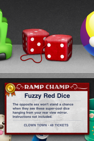
Gedeon
One of our first games, Ramp Champ—I don’t know if you remember that, it was a skee-ball game that we created for the iPhone—that game is was so labor intensive in the art department it was unreal. There were so many assets that had to be designed, developed, produced. There were prizes, lanes, sound effects, music tracks—everything that went into that game to try to make it as texturally and visually rich as it could possibly be. I look back on that now and I don’t know how the heck we did it.
Mark
iOS also heralded another meaningful, if subtler shift. Windows and Mac OS were traditionally designed around the filesystem and the desktop, which contained freely arranged apps, folders, files, servers, connected devices.
But iOS was app-centric, built around the home screen: a strict grid of apps, and apps only. An application’s icon had always been important, but suddenly it was do or die. Every app fought tooth and nail to earn a spot on the user’s first home screen. Stand out or be ignored—or worse, uninstalled.
Gedeon
When companies go about this, they often start at the icon because the icon is usually the point of contact for them as a brand—or their company—to the public. So when you see that app on your home screen, that icon, whether it’s Instagram or Facebook or Trivia HQ, that is the thing that you come to associate with that brand. And so it is intensely important that that thing that is designed is good, valuable, and has been thought out.
Mark
Of course, a number of icons were just company logos, but a ton of them were little canvases, objects in miniature rendered in painstaking detail. Think of the original Instagram icon: a little instant camera, complete with leather and plastic, a shiny glass lens and a viewfinder. The center of the iPhone interface was a grid of illustrations.
In those early years, as the device caught on with consumers and expanded across carriers and across the globe, each new iPhone model sold more than all the previous models combined.
It was a juggernaut, the most successful product of all time. Not phone, not computer, most successful product, built, first and foremost, for consumers, who, as both user and buyer, place a premium on user experience.
The iPhone was, to millions of people across the world, their aha moment. And given a taste of great design, users began to insist on it. The table stakes had been raised. The rules had changed. Software makers that had coasted on “good enough” user experience scrambled to catch up. And incumbents like Blackberry that failed to recognize and address this fundamental shift ultimately crumbled.
Apple opened eyes and set standards, but ultimately, the story of design and illustration’s triumph in tech is the story of average people: consumers like you and me, worldwide, who voted with our wallets in unprecedented numbers, proving, once and for all, the business value of good design.
And as in any major disruption, new opportunities arose. That early experimental App Store full of wild new ideas led to wild new companies that put good user experience at the core of their identity, like Airbnb, which was literally co-founded by designers. It led to apps that simply couldn’t exist without the smartphone, like Uber and Lyft, which are predicated on the assumption that you have an internet-connected, GPS-enabled device in your pocket that can easily and securely process payments. And having the internet in your pocket meant a complete reinvention of messaging and communication.
Of course, we can’t talk about communication on smartphones without discussing emoji, which came to the iPhone in 2008—same year as the App Store.
Emoji originated in Japan in the late 90s. The simple 12 pixel by 12 pixel images were drawn by Shigetaka Kurita for the country’s main phone carrier, NTT Docomo, and were intended as a new way to quickly convey simple information. The word emoji is a mashup of Japanese words for “picture” and “character” (a typographic character, that is). These charming pictograms were enormously popular, and in the coming years, became ubiquitous across Japanese handsets and carriers.


Five of the original emoji set, created by Shigetaka Kurita for NTT Docomo
When Apple was preparing to launch the iPhone in Japan, they knew it would need to support emoji. That brings us back to Angela Guzman, who, as a summer intern in 2008, helped create the company’s first emoji set. It was a fitting task for Angela, whose early love of art was rooted in its power as a form of non-verbal communication.
Angela
As a child, I really fell in love with drawing, for example, because when I was very little, I moved to Florida from Columbia. And at the time I didn’t speak a word of English, so it was really difficult to communicate with my classmates.
And what I ended up doing was drawing—not just for entertainment purposes but also to communicate. And so, pretty soon I became known as the artist in my classroom and I got my first set of friends because I could draw pictures for them.
Mark
Her interest in art only grew from there.
Angela
One of my sisters was an architect in Columbia, and she was quite older than me. She showed me so much that you could do with a design discipline, as a little kid. So I remember watching her making her models, her blueprints, and all these architectural pieces that I basically had, like, the best Barbie houses at the end of her course. And so I fell in love instantly with the design industry. And for as long as I could remember, all the way through high school, I wanted to be an architect.
Mark
But as a high school senior, Angela’s art teacher wanted to make sure she was aware of all the other creative disciplines she could potentially pursue. They sat down together and began looking through the course catalog for the Rhode Island School of Design.
Angela
And in flipping those pages. I found industrial design and I said, “Oh my gosh, this is it! It’s like miniature architecture!”
Mark
The next year, Angela found herself moving from sunny Florida to snowy Providence, where she pursued a bachelor’s in industrial design at RISD, followed by a masters in graphic design. As Angela neared the end of her second year in the MFA program, she attended a portfolio review and recruiting day where she met a representative from Apple. She landed an interview, and though she was nervous that her work leaned a little too far towards print and exhibition design, they liked what they saw and she landed a summer internship. She knew she’d be on the iPhone team but didn’t know precisely what she’d be working on.
Angela
And they said, “Oh, here’s your summer internship project.” And I remember somebody in the background sort of laughing a little bit when they were handing this to me, like, “Wow, she’s gonna be busy for three months.”
They’re like, “Do you know what an emoji is?” And I said, “No, I don’t know, actually. I have no idea.” And I felt embarrassed saying that, but I, again, being honest, I was like, nope! And they’re like, “Oh, you know, it’s these Japanese characters that are used in these phones and the carriers, et cetera,” and so they explained, and then they’re like, “…and you’re gonna be drawing, you know… a large set, and we’re gonna pair you with a mentor to help you kind of get started.”
And then I realized how many they were going to ask me to draw and that this was my entire project.

A selection of Apple’s original emoji set, created in 2008 by Angela Guzman and Raymond Sepulveda
Mark
Angela was introduced to Raymond Sepulveda, a designer and her mentor for the summer. They hit it off right away. They had a ton in common, including, as it turned out, having grown up just miles apart in south Florida. Raymond became a lasting friend.
Angela Guzman
Throughout the course of the days and the weeks and the months. We would just hang out together. We would go eat lunch with the rest of the team, but we would also sometimes meet after work because he lived in the area. So he became somebody that also just showed me Silicon Valley. So it was a really magical moment because I began a really lasting friendship.
Mark
Of course, it wasn’t all play and no work. They had three months to create over 400 emoji. There were a few key requirements. First, wherever possible, the set had to capture Japanese culture and symbolism.
Angela
If there were items I encountered that I had to render that I didn’t know what they meant, like some of the food items, I would go and look at them online or even go to a restaurant and look at things or a grocery store. And even for everyday items that I knew, I also would go to the grocery store and buy a certain fruit or vegetable, et cetera.
Or there were things that I owned that I thought were cool and that I should base it off of, whenever it didn’t tie to any symbolism from Japan. There were checks and balances, obviously, to make sure that the ones that did need to contain that symbolism were done in that format.
So I learned a bit of that culture. For example, when I drew the school bag, the backpack, it couldn’t just be any backpack. It had to be the Japanese backpack. And I didn’t even know that there was such an iconic type of bag. So I had to look at those and make sure they were captured correctly.
Mark
The emoji also had to fit the apple aesthetic: that “lickable” eye candy look that defined Aqua and, as Gedeon Maheux pointed out, involved a real learning curve. The icons couldn’t betray Angela’s or Raymond’s unique personal styles. They needed to speak with a single visual voice.
Angela
At the beginning, it was rough, because I had never drawn anything like that before. And I didn’t really know how to render in the Apple style, at the end of the day. So through a lot of desk chats and him looking at my screen and me looking at his screen and understanding how he was plotting the points and all these other things, like, I began to pick up on those tips.
And then obviously between Raymond and I, we’d do a lot of checking visually. Did this match what we’re going for? Does this look good? Does the orange and the strawberry seem like a set? And so occasionally we found ourselves also tweaking things as we were realizing, like, blue meant this or red meant that, and we have to change things here and there.

There were some objects that had shadows. I think, like, the vegetables and the fruits and a bunch of other clothing and stuff. The ones that appear to be sitting on something, right? Like, a dress wouldn’t have a shadow because it goes on a body and it has legs, but you don’t have the legs on the dress. And, like, faces and things like that, again, they don’t rest on a surface. But like, an orange sits on a table.
Mark
And of course, all the emoji had to be approved by Steve Jobs himself. No pressure, intern.
Still, even with the restrictions and the tight timeline, there were opportunities for Angela’s voice to come through. For example, the “dress” emoji wasn’t pulled from thin air. It was a specific dress her sister had made.
Angela
Yeah, yeah, I think that turquoise blue dress that has, like, a brown belt. And I think they still kept the same colors and everything. And I see them, like, in other apps as well. Obviously, the rendering has changed, but they use the same palette.
My sister didn’t know that I based it off of that dress that she made. And so, like six months ago or less I texted her and the picture of the dress and this emoji, and she was, like, over the moon. She’s like, “Wow! I had no idea my dress was the inspiration for that one!”
Mark
As the summer drew to a close, Angela and her fellow interns had to present their work to Scott Forstall, the Senior Vice President of the iPhone team at the time. She was nervous, watching as software development interns presented coding work.
Angela
And I’m like, “Mm hmm, mine’s all visual… [laughter] I wonder what they’re gonna think.” But I get up and I start talking about my emoji. And I remember seeing, like, the gigantic vegetables on the screen and walking him through that. And he asked me a few questions, but he was really happy with the results and kind of my presentation style.
Mark
So happy, in fact, that upon completing her master’s degree a year later, Angela joined Apple full time where spent four years designing flagship apps on Mac OS X and iOS like Mail, FaceTime, Photo Booth and more. And even as the look of Apple platforms evolved, Angela’s seminal work persisted. Apple re-drew their emoji a few years back, but the connection to Angela and Raymond’s original work is crystal clear.
And, of course, emoji didn’t stay limited to Japan. They soon began to spread by word of mouth, as users outside Japan figured out how to enable the hidden emoji keyboard. And once the keyboard became enabled by default globally, there was no turning back.
Emoji have become a worldwide phenomenon, now firmly rooted in our verbal and visual culture, and it’s no wonder. They are cross-lingual. They imbue otherwise stiff text conversations with subtlety of emotion, wit, and sarcasm. They are democratic, empowering everyone to express themselves visually, regardless of artistic talent. They are a powerful tool for inclusion, with new emoji added each year to better represent skin tones, gender diversity, multi-racial and same sex couples, regional foods and holidays, and more.
Emoji are so popular that they’ve even been known to help drive software updates. “This update fixes crucial security vulnerabilities.” The world yawns. But a notification that reads, “This update adds dozens of new emoji.” Download faster, damn you, faster!
Emoji have also created business opportunities for The Iconfactory, because they’re essentially fonts, sets of graphics interpreting a common list of concepts. Just, instead of letters and numbers, it’s “Face With Tears of Joy” and “Pile of poo.” Apple has their emoji font, and so does Google and Facebook and Microsoft and Twitter—the list goes on.
Gedeon
But then in the recent years, the main thing that we’ve been doing is emoji design. We started with Twitter, we did the original emoji suite for Twitter. Then we did the entire emoji suite for Facebook Messenger, which was a huge project. Every time Unicode adds a new block of emoji, we get more work, which is wonderful. It’s great job security. And it harkens back to those early days of Mac OS X and Aqua because it feels like that, designing them for that kind of space. We love to do emoji work and we love emoji in general.

A handful of The Iconfactory’s emoji suite for Twitter
Mark
But not all parts of the modern digital visual landscape are like emoji, with new work steadily coming each year and reliable customers willing to pay.
As the iPhone boomed, the world of custom Mac icons waned. Apple made changes to Mac OS X that, though ostensibly geared towards improving security, also made interface customization more cumbersome. In 2012, Panic and The Iconfactory discontinued CandyBar.
And as users became more familiar with touch interfaces, skeuomorphic designs became a bit less necessary and fell out of fashion. While illustration remains a powerful force in app design, the flatter look of the last several years has reduced demand for the kind of heavily illustrated app icons The Iconfactory excelled at.

The Iconfactory’s Stuck On sticker pack
But a few years ago, Apple introduced a feature to iOS that Gedeon hoped might offer those Mac icons a second life.
When Apple revamped iMessage in 2016 enabling third party app integrations, they also added stickers: static and animated graphics users could stick all over their conversations. Artists could package up their graphics as sticker packs, and users could buy them in a special store within Message.
Gedeon
We were so excited about them. We created, I think, fifteen sticker packs at launch? We had all of these titles of icons that we were like “Oh, these would make great stickers! These would make great stickers!” And Halloween, and you know, all of these things. And we’re like, “We’ll make them into stickers and they’ll sell gangbusters and it’ll be great! It’ll be just like making freeware icons all over again!” But that hasn’t been the way it is.
Narration
The iMessage App Store unfortunately proved tough to find. Apple has taken a couple stabs at redesigning it, but even with the perfect UI, there’s a bigger problem. Money.

The Iconfactory’s Sunshine Smilies sticker pack
When the App Store first opened, it wasn’t uncommon to pay five or ten bucks up front for an app. But prices soon raced to the bottom.
Gedeon
Like things in the App Store, people just aren’t willing to pay for them. They expect them to be free. And so when you release a sticker pack and it’s 99 cents, people balk at buying it. I will just go find another sticker pack of something that’s similar that is free and get that instead.
And so we just stopped making stickers. There’s just not any money in it, unless you are a major company like Marvel or Disney and you can charge for those premium stickers and people are willing to pay for them.
I wish this wasn’t the case. I would love nothing more than to create a new sticker pack every month for The Iconfactory and release it. I wish we could do that. I wish I could justify the amount of time and effort and cost that that would involve in order to do that. But I can’t.
When you’re small company, you have to pick and choose your battles. You can’t do it all. And unfortunately, that means cutting loose things that don’t pay the bills. And that’s one of the reasons why we don’t do freeware anymore. It just… I mean, it helped us grow and become known as a company, but it didn’t help pay the bills, in the long run. We have to focus on client work and software that does help us pay our mortgage.
Mark
In a sense, the embrace of design in the App Store and the tech industry as a whole should be good for creatives, good for illustrators. Countless creative professionals are enjoying full-time employment creating stickers and animated filters and visual effects in-house at places like Instagram and Snapchat. But when users expect those free social networks to come with free visuals, they start to expect all this stuff for free. The result may be more full-time opportunities, but a harsher ecosystem for independent creatives.
But even with these headwinds, I’m optimistic. Today’s 22 year old college grad was just ten years old when the iPhone debuted. An entire generation has come of age in a technology world that embraces design, a world full of illustrated interfaces, icons, and emoji, of higher expectations for user experience.
Kristen Spilman, who led design and illustration overhauls at Facebook and Dropbox, sees a profound example in her pre-teen daughter.
Kristen Spilman
You know, my eleven-year-old daughter understands logos at this point, and choosing typefaces. But at that time for me, I had no idea what graphic design was. And I think you hear this a lot. I might be kind of dating myself because now design and graphic design are just par for the course.
It’s pretty wild. You know, you go to the Apple Store now and there’s, like, weekend education offerings where they’re teaching you about the history of fonts and how to make your own font and new drawing tools that are available. And let’s understand the power of layers and whatever the latest, like, Apple or Procreate, whoever makes these things… And it’s wild! My daughter soaks it up and I’m sitting there right with her, kind of taking on these new tools.
But what’s even crazier to me is that the way that she’s understanding, adopting, and then adapting these skill sets. You know, she sees Instagram stories and understands, like, what might be effective in terms of communicating in that lens versus making a looping video in Musical.ly. And she’s really considerate about, around the aesthetics of all of these choices.
Mark
In an era of unprecedented visual literacy, pervasive design, and widespread access to technology, it should come as no surprise that one of The Iconfactory’s latest projects is a creative tool. Their app, Linea, is my favorite way to draw with my iPad Pro and Apple Pencil. It’s the closest thing I’ve found to a digital sketchbook. Lightweight and fast, with simple, but powerful tools and an interface that gets out of the way.
Gedeon
And I have to say, of all the things that we’ve made over the years, it has got to be my favorite thing. I love this app. And I don’t want to sound like I’m bragging or anything about it, it’s just, it comes from a place of love as an illustrator and a designer that we can make a tool that I myself love using every day. I do use it every day in my job.

And I want it to be the best at what it is. I want to be able to continue using it and creating it and improving it, and in order to do that, it needs to make money. And hopefully it will continue to. Right now it’s doing pretty good, but we always have to keep pushing forward and finding new ways to get people interested in buying it.
Mark
I’m hopeful that, for The Iconfactory, a more design literate world increases the chances of a bright future. After all, they’ve proven resilient and undeterred by a rapidly evolving industry, from tiny glyphs to huge icons, from Mac to iPhone and iPad, freeware to stickers to emoji to Twitterrific to Linea. In over twenty years of business, they’ve consistently found creative ways to produce creative work.
This spirit of adaptation draws my mind to something Angela told me. And something Guillermo told me. And Kristen. And Khoi and Kevin and Jennifer and every single person I spoke to for this series. I ended each interview with a request for advice. What would you say to the young illustrator about to embark upon the world? To the seasoned illustrator looking to move into the technology sector? To the company that wants to embrace illustration in its product or brand?
And in every interview, I heard variations on the same theme: that adaptation may be the artist’s greatest asset. Creative industries have always been in flux, responding to changes in medium and materials and tools, changes in the structure of employment and self-sufficiency, in technology and distribution, changes in attitudes, changes in government and political climate.
To succeed in the future, you’ve got to understanding the past, live on your toes, and always look ahead. All that and more on the next and final episode of How to Draw a Startup.
[Theme music]
Mark
How to Draw a Startup is written, produced, edited, and scored by me, Mark Grambau.
You can subscribe to the show via Apple Podcasts, Spotify, or wherever fine podcasts are found. And while you’re there, please leave a rating or a review!
You can also find the show on Twitter or Instagram at @drawastartup, or on the web at howtodrawastartup.show.
Of course, a thousand thanks to Angela Guzman, Gedeon Maheux, Guillermo Mont, and Kristen Spilman.
Neither my guests nor I speak on behalf of our respective employers.
Speaking of employers, after a decade in big tech, from Apple to Airbnb to Google, Angela Guzman recently stepped out on her own to start something new. Her project is still under wraps, but please join in me in wishing her luck and following along at Tijiko.com. That’s T I J I K O dot com.
And if your ears crave more podcasts, I recommend Welcome to Macintosh, from independent radio producer Mark Bramhill. It’s all about the history and culture of Apple and its community. I especially recommend the first four episodes of season three, in which Mark reports—first hand—the process of how new emoji are introduced. You can find it at Macintosh.fm.
On the next and final episode of How to Draw a Startup:
• • •
Allan Comport
I repped an artist once, and he was tired of his his gorgeous, beautiful paintings that he was making. But he wanted to do something really loose and free and almost cartoonish and stuff. And so he decided to create an entirely new persona and worked under a pseudonym. And in our advertising, there was the page with, like, his work on it, and then there was this page with this other guy’s work on it, who had a new name and a new style and everything.
And he actually put two lines in in his studio, and he used two different voices. And when you’d would call the one, he’d go, “Hi, this is Mike, how are you? Yeah, I can do that.” And then when they’d call the other one, he’d go “G’day, this is Glenn, how can I help ya?”
Whitney Sherman
Well, a “free lance” was a mercenary, somebody that would go and fight for anybody anywhere. And even that has some negative connotations that I think are bad, because that basically says, “I don’t care who I work for, I will do it.” So I think it’s really important that we, as illustrators, think of ourselves as “independent creative business people” rather than “freelancers,” because that takes a little of the substance out of what we actually do, when we think of ourselves as somebody that’s just like, “Got a coat, got a sword, I’ll be there!”
• • •
Step 7 arrives on March 21st. Until then, thanks for listening!