When humanizing technology means illustrating humans (or even human-like characters), opportunities and risks abound. A tone-deaf approach could irritate, or worse, offend. This week, we learn how to represent people with an eye towards representation.
Show notes
Today’s guests:
Recommended reading:
Your Face Here
Jennifer Hom’s case study on her work to create an inclusive illustrative brand at AirbnbYou Can’t Just Draw Purple People and Call it Diversity
Meg Robichaud’s guide to illustrating characters with a commitment to diversity, inclusion, and confronting one’s unconscious biases.The Life and Death of Microsoft Clippy, the Paper Clip the World Loved to Hate
A great profile on the history of Clippy—from inspiration to inception to derision.
Transcript
Mark
Kevin Walker, creative director at Buck, has a hypothesis about the use of illustrated characters in tech.
Kevin Walker
I would say the original tech foray into this—this is probably not true—was Clippy. Do you remember Clippy? [laughter] And I think that it was a mistake. I think the intention was there, it was about trying to make something relatable, but I think that it was so off the mark and became such a punchline that that the tech companies got scared at that point. They’re like, “we don’t, we’re not in character creation,” and like, “whoa, this is not what we do.”

Settle down, Clippy.
Mark
Though I can’t say definitely say whether or not Clippy scared off a generation of technologists from anything to do with characters, Kevin has a point here. For the blissfully ignorant or those who’ve just blocked this out of their memories, Microsoft Office ’97 included a new feature: the Office Assistant. It was essentially a help menu and autocomplete wrapped into a little animated avatar. There were a handful of options to choose from: a cat, a dog, a wizard, William Shakespeare. But the default—and most notorious, that we still remember two decades later—was Clippy, an animated paperclip with googly eyes and way too eager of a personality. Type so much as the word “dear” and pop! There he was.
Clippy
Hey there, it looks like you’re writing a letter! Want some help?
Mark
Get the [bleep] out of here, Clippy, I’m trying to write a letter!
As annoying as Clippy was, you can sort of understand the idea behind it. Back in Step 2, we learned that illustration is often called upon to humanize technology, to forge an emotional connection and demonstrate that there are real people behind the software. And what better way to humanize than to show, you know, humans, or even human-like characters?
Maybe you want to show people enjoying the product, or maybe you want to illustrate an aspirational scene to represent the life your potential customer could be living, if they had your service.
The intent and the potential benefits are clear. What may be less obvious are all the potential pitfalls. A tone-deaf approach could result in a nuisance like Clippy, or worse, it might outright offend.
I’m Mark Grambau, and this is How to Draw a Startup: A step-by-step guide to illustration in tech.
[Theme music]
Mark
Step 4: Humanize, don’t ostracize.
In today’s episode, we’ll explore three different ways to introduce people into your illustrative brand: anthropomorphized objects, anthropomorphized animals, and of course, depicting actual humans.
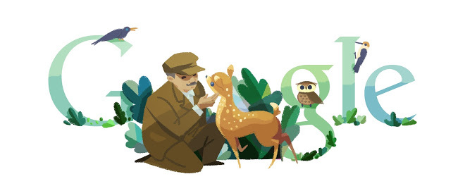
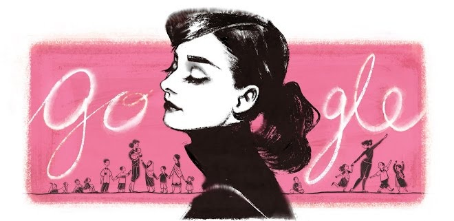
To kick things off, we’re going to start with one of the most prominent examples of illustrated people in tech: Google Doodles. For years, Google’s homepage has been adorned with illustrated celebrations of holidays and tributes to remarkable people like Freddie Mercury and Frida Kahlo. But it wasn’t always this way. Just as illustration at Dropbox began with a sketch of a cockroach, Doodles got their start in a sort of mundane, under-the-radar way.
Jennifer Hom
Well, with Google Doodles, it started because Sergey Brin and Larry Page are going out to Burning Man and they wanted to leave some kind of “out-of-office notice” for the homepage. And then they just, like, did this little thing on their logo, and after that they decided to put in an engineering intern at the time, Dennis Hwang, in charge. And he wasn’t an illustrator either.

The first Google Doodle, intended as an “out of office” message while founders Sergey Brin & Larry Page were off at Burning Man
Mark
That’s Jennifer Hom, who we met in the last episode. Jennifer joined Google straight out of art school, having just earned her degree in illustration from the Rhode Island School of Design.
Jennifer
So in 2009, when I started, I was the fourth person, and it was complete chaos. It was so different from what it is today. So it was four people; I was the first person who was trained in illustration to join the team. The other people who were on the team were designers first or interns first who had just converted over to the Doodle Team. We had a manager who had no background in art or design, and we had no resources.
Mark
Jennifer came aboard right as the team was starting to really professionalize. Still, there were old rules they had to contend with.
Jennifer
We were not allowed to use any kind of sound or motion or interactivity. First of all, we didn’t have the resources to do that, forget about that, but it wasn’t allowed.
We had to export everything as a GIF, and I still, to this day, don’t understand why, because the image quality is so bad! [laughter]
Mark
Okay, so: keep it simple, keep it GIF. Easy enough. But the most restrictive rule of all? They weren’t allowed to draw people. Why? Where did this rule originate?
Jennifer
To my understanding, part of the philosophy of this very minimalistic homepage, part of that influence came from Marissa Mayer, who was one of the executives at the time. And she happened to be our executive sponsor because her childhood involved a love for art, and it tied her and her mom’s relationship closely together.
And I think it was her personal preference to never show people, because I think she thought that, like, drawings of people were a little bit uncanny and she didn’t like to see them.
So I think, in a way, it was frustrating for me at first because I came out of art school, I love drawing people. It’s, like, the easy thing to do, but her preference forced us to think more holistically about our subject matters. Whenever we celebrated, like, a specific person’s birthday, we would have to think about what that person contributed to society instead of their face, which is a great perspective, it’s a great stance to take. It’s more editorial, it’s more educational, like, to just see someone’s face, I’m like, “why does that face matter to me anyway?”
Mark
When Marissa famously left Google in 2012 to become CEO of Yahoo, the Doodle team was given the opportunity to carve a new path as part of the search product team. They grew in prestige, independence, and headcount. They pursued animation, interactivity, pop culture, and yes, they started drawing people. The Doodle team had always drawn major holidays, birthdays of notable people, sure, but often from a US perspective. As they grew, they took on more holidays and pop culture from around the world, drawing on Google’s increasingly global talent pool for recommendations.
Jennifer
We would get some, like, fun stuff in response. Like, India has this thing called Kite Festival. Germany has, I think, Asparagus Day. And we would just get, like, such interesting facts about all these countries around the world that we otherwise would not have known of if we were just, like, incubating ideas in Silicon Valley.
Mark
They were very careful when choosing the right subject matter to pursue.
Jennifer
Yeah, and then we would just, like, get in a room, look at a spreadsheet, and look at Wikipedia for all these people and these holidays that were suggested to us and do a couple checks, like, is it relevant to Google? Is it, like, innovative or artistic? We would do a Nazi check. So if a person that was on the list was alive during, like, the 1940s, we’d be like, “All right, was this person a Nazi?” Which is, like, a real concern!
Mark
Yeah! And for a company to put someone on the homepage here is, in a sense, an endorsement.
Jennifer
It's a huge endorsement, and it’s like a “brand coupling,” and you don't want to couple with someone—so here was another rule that we had: We didn't do a Doodle for someone's birthday who was still alive, and that's because people can surprise you at any point in their lives!
So we would like to have a closed circuit of information on what we’re celebrating. Like, we want to know everything there is to know about this. And if you have a celebration for a person and they could have done amazing things in their lifetime, but then they kind of like, have, you know, like a turn of preferences or whatever at the end of their lives, and you’re like, “Oh, I shouldn’t… I shouldn’t have, like, celebrated that so fast.”
Mark
In the “Me Too” era, this seems more relevant and obvious than ever.
Okay, so there are plenty of reasons to not draw someone. Nazi? No thanks. Still alive? Let’s not risk a possible closet full of skeletons.
A selection of Jennifer Hom’s Doodles, sourced from her portfolio site. Be sure to check out the full gallery, as well as her interactive Doodles!
But there’s a flip side to consider. Every person you do choose to celebrate means a mountain of others you’ve ignored. About five years in to her time at Google, Jennifer and her team decided to take a look back on who they’d Doodled.
Jennifer
We just pulled metrics on who we were celebrating, and we found that we were celebrating so many more men than women. Unbelievably more. Throughout all of history. There were maybe far less than 30% women than we were celebrating relative to men.
And we decided to put a line in the sand then. And we told all of our local Doodle manager partners who were giving us ideas, and we told ourselves as a team, from now on, we are celebrating 50% women. No exceptions.
And countries would come back to us, they said, “We don't have 50% women to celebrate,” and we said, “Yes, you do. They were just overlooked in history, and you've gotta dig.” And we all did it, and to my understanding and to this day, we have hit that metric every single time.
Mark
Of course, few tech brands call for illustrations of real world figures.
But most brands do benefit from being able to show people in one way or another. For example, a great way to communicate the value of a product is to show its effect on your customer, the “after” photo in an exercise equipment commercial.
I’m reminded of a fantastic graphic by user experience designer Samuel Hulick. It’s a simple addition equation. The two items on the left being added together are Mario and a fire flower. Sam labels Mario as a “potential customer” and the flower as “your product.” Then, an equals sign. So what’s on the right? What does Mario plus fire flower equal? Well, a bigger Mario, decked out in new clothes, throwing fireballs, labelled in Sam’s graphic as “awesome person who can do rad shit.” Sam’s point is that your company doesn’t sell fire flowers. It sells the right side of the equation. In Sam’s words, “People don’t buy products; they buy better versions of themselves.”

Illustrating this approach requires the ability to represent your customers. And how you depict people comes hand in hand with who you depict. It’s a choice and a responsibility.
Jennifer
So there, there is this thing in illustration. It's easy to just draw the status quo, it’s easy to draw what is fashionably acceptable, and it's easy to draw yourself.
Mark
The trouble with just drawing ten variations on yourself and those around you, aside from just being sort of artistically boring, is that you are not representative of your user base. No single person is. Technology’s ability to reach across the world means the industry’s addressable market is infinitely diverse in gender, age, geography, socioeconomic status, race, religion, ability, you name it.
We illustrators are uniquely suited to tackle this part of the problem. We’re not photographers, the reach of our lenses limited by a travel budget. No, an illustrator’s only limits are time and imagination.
With that in mind, if you can draw anything, perhaps you need not draw people at all.
Quentin Vijoux
My name is Quentin Vijoux, and I’m a French Illustrator. I'm working and living in Paris.
Mark
Considering I studied Spanish in high school and am terrible at pronouncing French, I wanted to make sure I didn’t mangle my guest’s name.
Mark (in interview)
You introduced yourself at the beginning with your beautiful French accent, and I know I said “QUEN-tin” [ ˈkwɛntɪn].
Quentin
Oh, you can just say “Quentin,” it’s okay, thank you. In French, it’s “Quentin” [kɑ̃.tɛ̃] …
Mark
“Quentin” [kɑ̃.tɛ̃]
Quentin
… but yeah, this sounds doesn’t exist in English, so it’s not easy. You can just say “Quentin” [ ˈkwɛntɪn]. It’s okay.
Mark
I’d like to, if I’m introducing you, to make sure that I’m introducing you at least somewhat close to the actual pronunciation of your name.
Quentin
Yeah, that’s nice, you did it well. It’s “Quentin Vijoux.”
Mark
“Quentin Vijoux”
Quentin
Oui! Perfect!
Mark
Merci!
Quentin
[laughter]
Mark (as narrator)
A few years ago, Quentin was hired to do some freelance illustration work for Intercom. In addition to their tools for online business, Intercom also publishes eBooks on business, marketing, et cetera. Quentin was brought in to illustrate those eBooks, and after a few successful projects, was tasked with revising the company’s entire brand identity.
Quentin
Well, it was a lot of time to refine early concepts in order to have a new approach, very different from what you can imagine from a tech company. At that time, tech companies had very geometric, vector style, very cold. So the idea was to give something very different, and something… I don’t know if “crazy” is the right word, but very human.
We started to work on this project together. We built out this concept with animals.
Mark

The business owner chats with its customer, from Quentin Vijoux’s brand refresh for Intercom.
Quentin created a cast of anthropomorphic animals, brightly colorful rabbits and hippos and giraffes, all walking about on two legs, dressed in human clothes, and living in a very human neighborhood. The protagonist was a blue dog wearing a captain’s hat, a business owner who represented Intercom’s customers.
Quentin
And he's always having small adventures with his clients. So there are always the same animals. We can find a pink bird, she's an important client. And other animals, there’s an elephant, there’s a mouse, and so on. So the idea was to find a metaphoric way to explain how this e-business can be related to a classic business where you can talk with all your customers really fluently, easily. An important part of the project was to explain every product, every aspect of the product, into the metaphor of the shop.
Mark
The characters also helped to create a unified corporate brand, the world that all these animals lived in, while still giving each product in the suite a distinct voice. Customers across business segments could see themselves in different characters and tailor-fit scenarios.

The Intercom homepage during the time of Quentin’s animal-centric brand system
Quentin
You can either decide to make something very, very different to communicate for each target, but you will lose the consistency of the brand. So it’s important to build a visual universe where everyone can find his own place. So it was maybe the idea to make many characters. So when we wanted to focus on the customer experience, we made the bird, the pink bird customer. This bird was the main character of some adventures, and it was the dog, who is the owner of the shop, who was the main character of other adventures when it comes to talk to business owners.
Mark
Quentin was conscious that animals could represent everyone without ever depicting anyone. Every viewer had an opportunity to find themselves in an unexpected way, like choosing your spirit animal, or, for my fellow Harry Potter nerds, your Patronus.
Quentin
Yeah, it was totally intentional. Yeah, it was a way to draw very really different kind of people, different shapes and silhouettes, and so on. And the colors and the animals were a well good way to have this inclusive representation of the customers and clients.
Mark
In the years since, Quentin’s animals have been replaced by an entirely new look across Intercom. His illustrations were a refreshing departure from the tech brand status quo at the time. They were richly textural and expressive, with hand-drawn characters and watercolor backgrounds. In that regard, they were really ahead of their time.
I went through a phase of using animal characters at Circle as well, but in the end, it really wasn’t the right fit. Instead, most of my work from the last year has depicted people as people. And representing the customers of an increasingly global brand means keeping diversity and inclusion in the front of my mind.
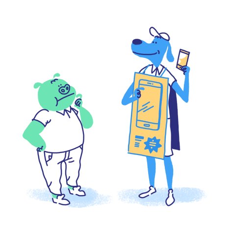
As a freelancer, Hannah Swann has found that, for the most part, clients are on board with this thinking.
Hannah Swann
Being absolutely mindful of, like, the people that we’re drawing is a small step, but a really important one. You know, I try to just, like, be really mindful of that and draw, like, a diversity of body types, skin colors, genders, ability levels… and I think what's nice, too, is that even if people are uncomfortable with it, I think they're like, “okay.”
Mark
There is one place in which she’s gotten actual push back from clients.
Hannah
I've tried to bring some awareness of trans people and gender diversity into my drawings. And that is the only, that's the only situation where people actually do push back. I mean, it really speaks to a level of awareness that people have in general, but the drawing makes them uncomfortable. And I'm like, okay, so therefore, like, the, you know, the person this is representing would make you uncomfortable.
It's hard to really advocate across, you know, like… the core of what the issue is, is like, if you're not familiar with this representation, you know, like, that's not because this person doesn't exist. It’s because there's so little representation. Or someone's like, “Oh, this person’s, like, androgynous. I don't get it.” And I’m like, that’s…
Mark (in interview)
That’s sort of the point…
Hannah
That's the point! Yeah. So it's really interesting. So people will push back and I explain, and then they're like, “Okaaay…“ But yeah, they're like, deeply uncomfortable.
Mark (as narrator)
Ultimately and unfortunately, one’s ability to advocate can come down to social capital and the nature of the relationship between the illustrator and the client, whether freelance or in-house.
Hannah
I think a lot of clients specifically have sought me out because I’m, like, you know, I'm out on the internet, like, I identify as queer. Like, people know that. And they come to me with, like, you know, illustration projects that, like, may feature an LGBTQ population. So I've been really lucky that I've been able to work on some of that stuff.
I think if I was working on a project for a bigger company who didn't seek me out for that specific reason, like, I would feel hesitation about advocating. I mean, I've seen it play out, right? Where, like, I advocate… you know, like, because I work with, you know, Ryan Putnam, as I mentioned earlier. And he has a lot more social capital than I do because he's older, he's a man, and, you know, where he's able to advocate and people are like, “Okay, thumbs up, got it.” And then, you know, if I were to do the same thing, I would get a lot more pushback.
And I think so many people are really tentative about it. And people are scared to draw things outside and represent things, like, outside of their comfort zone.
Mark
For progress to be made, the people already in tech need to face that fear, because the industry’s diversity and inclusion issues won’t be solved overnight.
Looking in the mirror, I see a straight, white, able-bodied, cisgendered man. I see a beneficiary of the tech industry’s diversity problem. I have the social capital Hannah outlined earlier. Privilege is power, and if Spider-man has taught me anything, it’s that with great power comes great responsibility. I have a responsibility to use that social capital to benefit others. To see, hear, and amplify the underrepresented. To effect change in hiring and in my work as an illustrator. To Jennifer’s point, to not just draw variations of myself and my immediate peers.
Of course, hiring a more diverse workforce will bring crucial new perspectives to the creative team. But that doesn’t mean the responsibility is simply transferred, it doesn’t absolve you. You don’t hire a woman to an all male team and say “Okay, you draw all the ladies now. Box checked, we’re good.”
It’s far more nuanced than that. Experiences like Hannah’s, where she was sought out to work on LGBTQ subject matter, can be a double edged sword. The responsibility to represent and speak for one’s entire community can be a burden.
In an interview several years ago, Jennifer Hom explained how she was once given the opportunity to create the Doodle for International Women’s Day, but she turned it down and redirected the project to a male colleague. I asked her about this moment, and she reflected deeply and honestly on her experiences.
Jennifer
Diversity and representation in illustration has always been a common thread throughout my career in tech, and I learned a lot while I was on Doodles. I remember that interview and I remember that project very clearly.
I felt the weight of what it means to be a woman for this day. And it's so varied and so heavy, it's like saying “what it means to be a human,” in a certain sense, because there's such a vast array of what that could mean. And I just found it incredibly overwhelming. And at the time I wasn't ready to take on that project, because I was still struggling with my ideas of femininity and how that conflicts with other people's ideas of what it means to be a woman. So I just became extremely overwhelmed by that entire concept. And I was only able to tackle Women's Day when I was a little bit more mature.
And I've taken this these learnings throughout my career and I, I think I've actually hit a moment where I brought it into something that is meaningful to me for my career long term.
Mark
After nearly seven years as a Doodler, Jennifer left Google and joined Uber. A year later, in the fall of 2017, she moved on to AirBnb, where she is today. It was a very intentional, personal choice.
Jennifer
So for Airbnb, the thing that attracted me to this company in the first place—besides their reputation for being leaders in design and besides their reputation for just having a great work life culture—was their motto, which is “belong anywhere.” And that was really important to me. It resonated with me a lot, because I grew up Asian American in New York… not a lot of other Asian Americans, so I never really felt as a child that I belonged anywhere because of representation, because of the lack of diversity that I saw around me or in media, movies, sports, TV, anything.
Mark
Jennifer’s task was to redesign Airbnb’s illustration identity. She wanted to take a closer look at what Airbnb actually did, how the service worked, really take the product and the brand through their paces. She approached her new coworkers to get their take on the illustration style.
Jennifer
I asked them, “What do you like about it? What don’t you like about it?” And the thing that came up with a number of the co-workers I talked to, who happened to have been people of color, told me that they didn’t think the style represented them. They saw that the style was line based, in that people and their flesh was outlined with a gray stroke, their skin was negative space, and the hair and the clothing was fill.

On the left, a previous Airbnb illustration style, where use of color and line imply a Caucasian character. On the right, characters created with Jennifer’s intentional approach to diversity. Sourced from Jennifer’s case study, Your Face Here
And these are technical aspects, but what it translates into is when you see something that's drawn with an outline and the only color on it is your sweater and your hair, the default assumption is that the person represented is Caucasian. European, Western, whatever. And I got this feedback several times from men of color. And I was like, “You're absolutely right. This is completely wrong for a brand that is supposed to show that you belong anywhere, because it not representing anyone.”
So when I started to develop the style, I was still in this position of feeling, honestly… it was a little bit of cowardice. There's a lot of hesitation to represent diversity in an honest way. I see it a lot in other places where the subject of diversity is kind of touched upon, in that people are what I call “fruit loop people.” They're blue, they’re green, they’re yellow, they’re pink, they’re purple, they’re whatever. They’re anything but actually diverse. Same body types, same height, same ages, same abilities—like physical abilities, same mental abilities—and there's this homage to diversity, but there isn’t honest diversity.
So when I started to redo the style, I knew that diverse and deliberate casting was going to be the crux of this identity for Airbnb, because that is literally who we are. We are a company that facilitates real life interactions of people across cultures, across the entire planet, and you cannot narrow that down to a few different types of bodies and a few different shades of skin color. So as I move forward with the style, I make sure that every time either I or my freelancers draw someone in an illustration, that character always has photo reference of someone who is or was alive on this planet at some point, because it's so easy to fall into what you were told was acceptable through the media while you were growing up, or draw yourself. It’s easy to just draw yourself, and like, I wouldn't want everyone at Airbnb to look like me, like, that's not what Airbnb is. So I ask my freelancers to give me photos of their family, give me photos of their coworkers or friends, celebrities that they like, whoever. Historical figures, like, everyone needs to be based on someone because this company is supposed to be everyone.
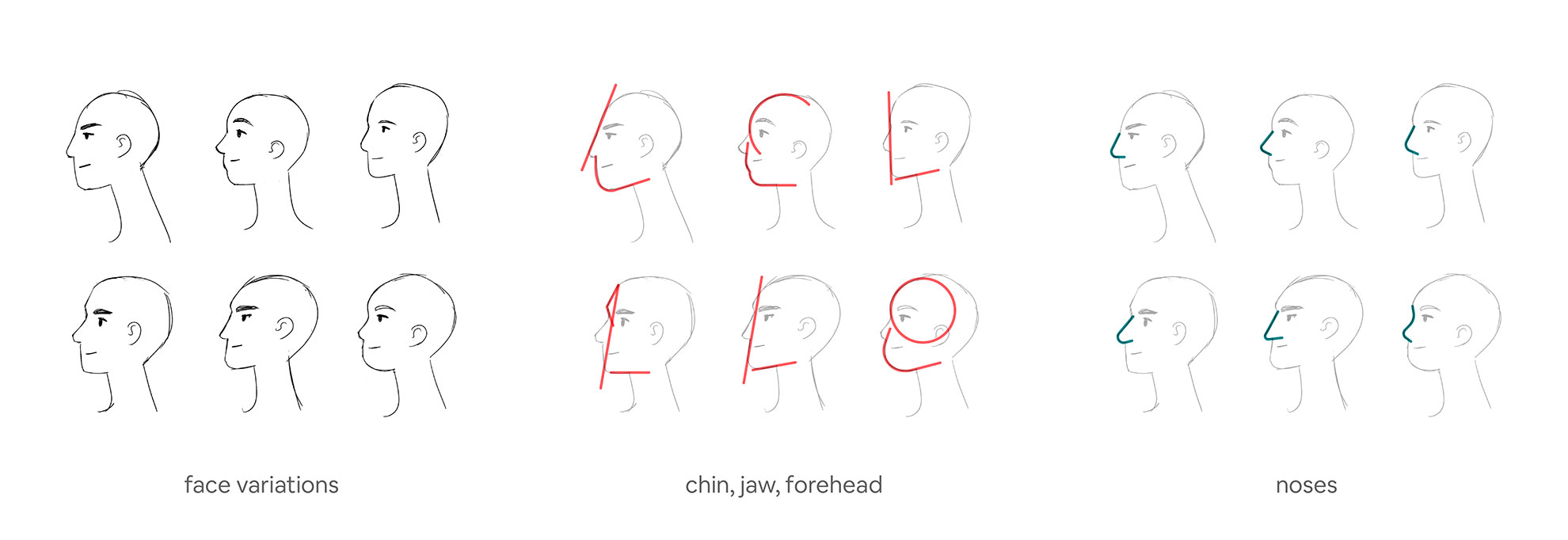
An exploration of various face shapes to ensure a robust, honest variety of character designs. Sourced from Jennifer’s case study, Your Face Here
So yeah, that’s a really long answer, [laughter] but diversity representation in tech illustration is something that is extremely important to me because I don’t want to continue this default style of drawing something that is safe and drawing something that is understood to be “that is a human because it is male” or “that is a human because it is Caucasian.” I want to go beyond that.
Mark
Hannah Swann echoed Jennifer’s recommendation to use real photo reference to get outside of your own bubble.
Hannah
If I were to like, radio broadcast a message to the illustrators and designers of the world, I’d just be like, “it's not that hard.” Like, there's plenty of resources online for, like, how to accurately shade skin tones and, like, represent a variety of skin tones. It's out there. I mean, I don't know that there's guides about how to represent, like, queer people and trans people, which is something that, I don't know, I've thought about actually writing at some point. But there's certainly, like, plenty of representations of these people in photography. It's out there, just find the reference material, like, don't necessarily make assumptions. It's there, and it's a Google search way.
Mark
Research is as fundamental to inclusive illustration as it is to inclusive design. And when a designer performs user research and interviews, they’re usually not looking to understand the user in a vacuum. They want to understand each user’s environment, the context in which they use the product.
In the last few episodes, Meg Robichaud has shared her comprehensive approach to developing and documenting illustrated brands. It should come as no surprise that she applies the same rigor to issues of representation, recognizing that inclusivity goes well beyond identity.
Meg Robichaud
I think diversity and inclusion, I think they're just part of the craft. You can't do it effectively if you're not thinking really hard about who you're representing and how you represent them. We can draw really diverse people who are doing really privileged things really easily. We can… one that we ran into a lot with Shopify is we just instinctually draw all these beautiful offices because, like, obviously we want to draw beautiful things. And it's just, it's not realistic to what these workspaces actually look like.
Mark
Shopify makes tools for retail businesses, from online stores to point-of-sale systems for brick and mortar shops. Have you ever been behind the scenes of a hip, charming independent retail store? Back of house is usually a fraction of the size of the rest of the shop with about 20 times more stuff crammed in. Shelves are packed with inventory, office supplies, and paper records. There’s a bathroom scarcely bigger than the toilet itself, and a desk with a computer, printer, and about three square inches for a mouse and keyboard. This is where the orders are managed and payroll is processed. Drawing that idyllic, perfect office space might be aspirational, but it’s also a punch in the gut when you feel like you’re working in Harry Potter’s cupboard under the stairs.
Meg
I think the responsibility part of it comes in because a beautiful desk is a fine illustration. And no one's going to tell you otherwise. But the better illustrators will take the time to do the research and find out how they can, like, go one step further to to be more inclusive.
Mark
If I could summarize Jennifer, Hannah, and Meg’s advice here into three short words, it’s this: do the work. If you’re going to represent people, draw beyond the status quo. We illustrators have the freedom of our imaginations, the ability and the responsibility to create a welcoming, inclusive environment.
Now, we have one last angle to cover. We’re going to end today’s episode where we began: anthropomorphized objects. Bringing objects to life isn’t a diversity cop-out, and it can definitely be done without veering into Clippy territory. It’s just another approach with its own time and place.
Back in Step 1, we learned that Dropbox went through a smiley face phase. Smiling documents in smiling boxes. This strategy is a bit different from that Super Mario analogy from earlier. Instead of directly portraying how a user will benefit from a product, imbuing inanimate objects with personality portrays how the things in the user’s life will benefit. If your stuff is happy, maybe you’ll be happy, too.
But Dropbox didn’t just bring documents and boxes to life.
Guillermo Mont
My name is Guillermo Mont, I’m a senior product designer at Guidebook.
Mark
We’ll learn more about Guillermo in a future episode, but in the mean time, I’ve brought him on to share a great anecdote from Dropbox illustration history.
Back in 2013, Dropbox acquired a company called Orchestra, and with it, their innovative email client for the iPhone, Mailbox. When Dropbox was preparing the Mac version of the app, they invited users to sign up as beta testers and slowly rolled out invitations, building up hype. They wanted that pre-launch excitement to translate into post-download delight, so when you finally got access to the beta, Dropbox didn’t just send you some 25-digit registration code to activate your license, ‘cause where’s the fun in that?
Guillermo
And they had these things called betacoins, and you would drag these coins from your mail application and drop them onto this, like, window. And the betacoins had, like, a face and animation to them, and when you dragged them over there, they were kind of, like, unsure of where you’re taking them. And then you would drag them over to, like, essentially where you redeem them, and they would get really happy because they knew that they’re going to be used.
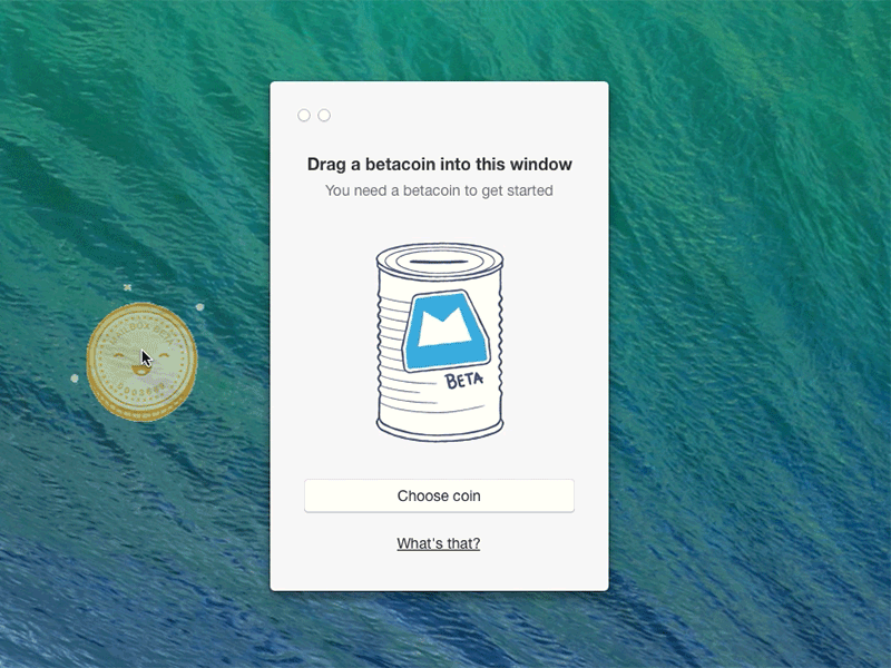
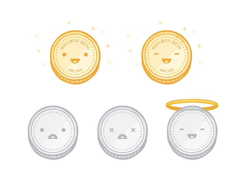
Betacoins! Created by Linda Eliasen and the Dropbox team. Sourced from Linda Eliasen’s Dribbble profile
And that just, like, floored me, you know? I just, I loved essentially, like—I’m sure it was tickling all these things in my lizard brain—but to me, it almost seemed to magical that you could essentially take this simple concept and just make it so engaging. And to me, that’s, like, that’s the power of having really good illustration. It’s essentially, you know, instead of redeeming a code, you’re taking this coin, who’s just happy to be used, you know? It’s such a better experience, and like, it puts your user in such a great place of, like, “this is going to be fun.”
Mark
With betacoins, Dropbox rethought the traditional software registration process, making it way simpler and infinitely more delightful. It injected a bit of personality and story.

Money messages on the move! Illustrated by yours truly for Circle Pay.
I tried my hand at this approach in my very first illustration at Circle.
When I joined the company in the summer of 2016, we were preparing an update to our payments app, Circle Pay. It was an integration with iMessage, which would enable our iPhone users to send cash directly within their text conversations. I was tasked with creating a graphic to accompany the money message.
I illustrated a happy coin with arms and legs, walking along and whistling a happy tune. It looked like a bit like the dancing movie snacks in that classic cartoon, Let’s All Go to the Lobby. It made the experience feel a bit less transactional. Your money was excited to go on a little journey! It fit into our irreverent brand and Circle Pay’s social focus.
In the coming months, money characters proliferated across the app. One illustration depicted a trio of tourist coins—a dollar, euro, and pound dragging luggage, taking pictures, and checking a map—meant to illustrate Pay’s ability to easily send multiple currencies across borders.
I was going for the same spirit that Dropbox had with their smiling documents. Just as files feel safe and secure on Dropbox, money loves traveling the world with Circle Pay.

Travel between $, £ and € with Circle Pay. No jetlag.
Of course, this approach has its limits. Expressing joy in a consumer product is one thing. Forcing an overeager avatar into an app for getting serious work done? Well, that’s Clippy.
Matching the voice and tone of the brand is key, as is understanding situational context. Nothing in Microsoft’s brand prepared you for a cartoon paperclip with the personality and persistence of C-3PO hopped up on espresso. On top of that, Clippy just wouldn’t… shut… up…
That’s the tricky thing about characters. Betacoins and happy documents only showed up once or twice, delivered a quick dash of whimsy, and got out of there. Avatars and mascots, on the other hand, inherently stick around. They have to be careful not to overstay their welcome.

The many faces of Duo, as seen in InVision’s profile on the character’s recent redesign.

As a joyful, encouraging teacher, Duo’s character fits right in.
I believe Duo works for two main reasons: First, the app and its brand have always been bright and bubbly, to convey the the idea that learning a language can be fun. A cartoon mascot fits right in. Second, and more importantly, Duolingo is fundamentally built around conversation. Call and response between teacher and student. By acting as the teacher, Duo has a legitimate reason to exist, unlike Clippy, who always seemed to be butting in.
Clippy
Hey there! How’s your letter coming along? I’d love to help!
Mark
All this to say that imbuing an image with personality and life and humanity will inevitably elicit an emotional response, for better or for worse. Here’s Meg Robichaud:
Meg
We also have some rules around when you can use characters or not, just because it kind of turns up the emotion. So, like, if it's a bad thing, maybe we won't do people, because then you have to draw, like, a mad guy. It just, it turns up the emotion. It’s unnecessary if we're not sure if you're happy about it.
Mark
Sorry we accidentally deleted your super important file. Here’s an illustration of a technician slipping on a banana peel! Yeah, not so much. In summary, be mindful of context. Feel the room.
Jennifer Hom takes this philosophy a step further, and generally advocates against illustration of any kind when presenting a negative situation.
Jennifer
We use illustration when we set up the trust, when we want to establish a relationship with our guests and our hosts. We reassure them that we will take care of them. That is when we use illustration.
When something happens that was not good—and that happens—we have other things in place to help our users in those moments. We don’t use illustration to apologize because I don’t want to have the user feel like we’re patronizing them. It could easily feel very patronizing to be, like, “I’m so sorry that X happened to you. Here’s a sad frowny face,” or like, a person in the rain. Yeah, like, that does not feel good. It’s not what people want. That’s not what I would want. If something bad happened to me, I would want action, and I wouldn’t want this image of someone looking sad.
So we like to put our money where our mouth is, I guess, and not try to clutter it with any fluff. We want to take action to make sure that whatever happened gets solved right away. Make sure there’s a real person behind it working with you.
So I pull illustration back there because I think it’s distracting. I use it to establish a trusting relationship, but I get out of the way when people need to go in and actually fix something that has happened.
Mark
I’ve been reflecting on this a lot in the months since Jennifer and I spoke. Her approach resonated with me, and these days, I’m increasingly cautious when using illustration in negative situations. We have a lot of tools in our brand toolkit. Just because illustration has a seat at the table doesn’t mean it should tackle every single problem. It’s the old “when you’re a hammer, everything looks like a nail” dilemma.
I think Jennifer put it best with this little nugget from her time as a Doodler:
Jennifer
The number one rule was “No bummer Doodles.” Like, don’t—and this is something that I carry throughout my career—illustration is there to either inform or celebrate or empathize, but it's never there to make you remember a bummer moment. Like, you don't want anyone to go to your product and have, like, a bad moment solidified in their head, so why would you celebrate it with an illustration?
Mark
"No bummer Doodles.” Simple, yet, surprisingly inspiring words to live by. A reminder that illustrating to humanize means illustrating for humans. We can’t predict every emotion an illustration will elicit, but we can aim to treat those feelings with respect. To uplift, to celebrate, and include.
Clippy
Looks like you’re all done! Time to play the theme song?
Mark
Oh, for [bleep]-sake, Clippy.
[Theme music]
Mark
How to Draw a Startup is written, produced, edited, and scored by me, Mark Grambau.
You can subscribe to the show via Apple Podcasts, Spotify, or wherever fine podcasts are found. And while you’re there, please leave a rating or a review!
You can also find the show on Twitter and Instagram at @drawastartup, or on the web at howtodrawastartup.show.
I’d like to thank my guests this week: Jennifer Hom, Guillermo Mont, Meg Robichaud, Hannah Swann, Quentin Vijoux, and Kevin Walker. These issues aren’t easy to discuss and I’m grateful for your deeply personal, deeply honest perspectives.
Neither my guests nor I speak on behalf of our respective employers.
This week I encourage you to read Your Face Here, Jennifer Hom’s extensive case study about her mission to ensure Airbnb’s illustrated brand is truly inclusive. The work itself and Jennifer’s writing are both remarkable. You’ll find a link in the show notes.
On the next episode of How to Draw a Startup:
• • •
Khoi Vinh
The illustrations that I was seeing from technology companies were all very geometric, very vector based, very anodyne. There’s a lack of texture, there’s a lack of grit, there’s a lack of human mark making. Virtually every technology company was choosing to communicate through that visual language. At what point does the value become commoditized?
Stewart Scott-Curran
Okay, well, just because it’s a tech company’s blog, it doesn’t have to look like everything else. Why not take a similar approach to illustration and to visualizing editorial as someone like Wired Magazine might do or the New York Times might do? Like, why not work with the best illustrators around?
You know, the writing on the blog is genuinely some of the best in the business, and it does the writing a disservice to have something super bland and kind of expected to accompany it.
• • •
Mark
Step 5 is coming February 14th. Thanks for listening!
Clippy
Looks like you finished your podcast. May I recommend another?
Mark
I swear, Clippy, I will get you stuck in a shredder!